21 Nov Project Mathieu – Game Plan
Hi everyone ! Today I can finally share with you the plans for Mathieu’s living room and kitchen ! Things are moving super fast over there so I’ll have plenty to share in the next posts, but I had to stop and remember that, unlike me, you don’t know the place or my brother so I need to ‘splain some things to ya !
I feel like the last post was pretty informative about both Mathieu and the space, so I won’t start over completely, but what I will do is bring you in on the process. Together we had discussed a fair amount about the space so I went ahead and made a floorplan of what I envisioned doing, based on his needs & wants :
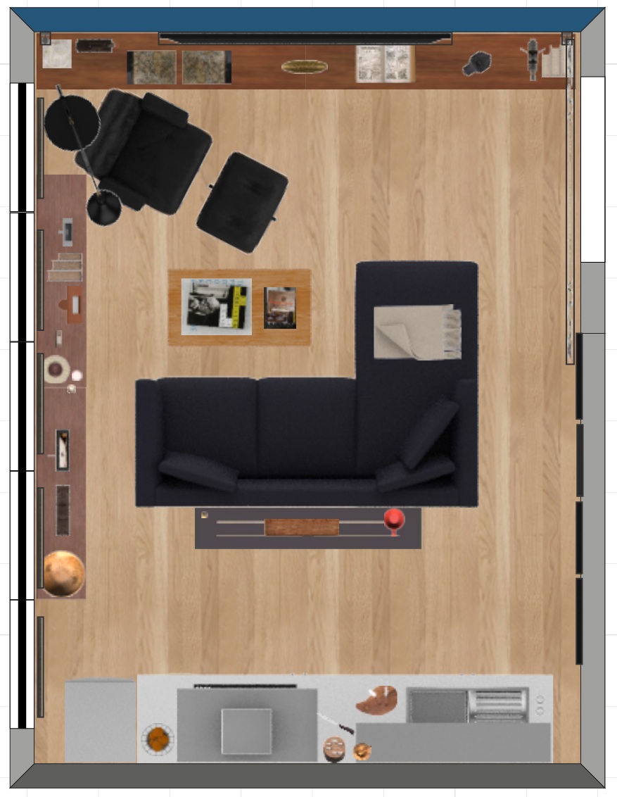 While trying to design a perfect layout for his everyday life in this space, I concentrated on :
-a comfortable space to read and work – with the bookshelf accessible from all chairs;
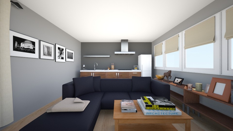
-a long, airy kitchen on the back wall, with a console behind the sofa for some more counter space.
Mathieu liked this option, so I went ahead and made some 3D renderings to give him a clearer idea :
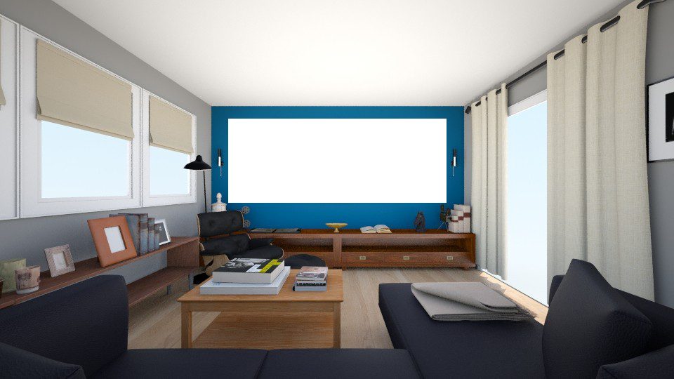 Knowing his daily routine pretty well, I could really imagine him in this space. But like I mentionned before, Mathieu sneakily started being more of an adult than me, so as we talked and thought about his plans, the layout evolved.
He realized that he wanted the kitchen to take more room, both in his home, and in his life (Wow, that was like real journalism, guys. Like a BBC report about a man chasing his dreams of becoming a chef while redoing his kitchen… Sorry my mind was wandering !). This layout was indeed perfect for him, but not for entertaining. He was used to eating on the coffee table, but he couldn’t see having a nice dinner with guest in the same space.
So we started thinking about adding a “dining space”, and, inspired by this picture, we transformed the console into a bar :
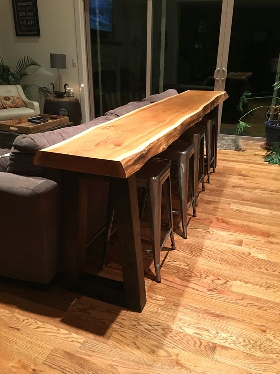 To make sure we were making the most of the space, we adapted it into half of a kitchen island, so we could add storage underneath ! (Small space geniuses, we are.)
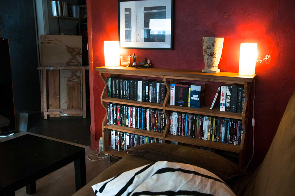
Along with this change in the plans, we realized we wanted to keep both of his hand-made shelves, but they were in different styles, and heights, so we couldn’t put them side by side :
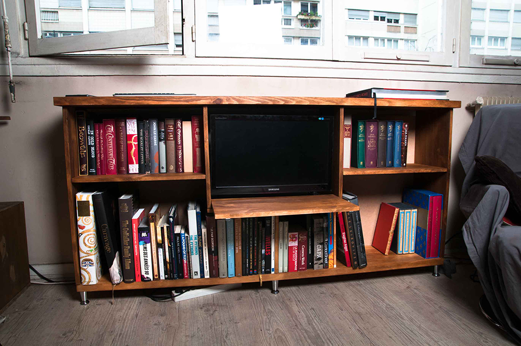 Instead we put one on each wall, leaving the pathway to the kitchen open on all sides instead of one.
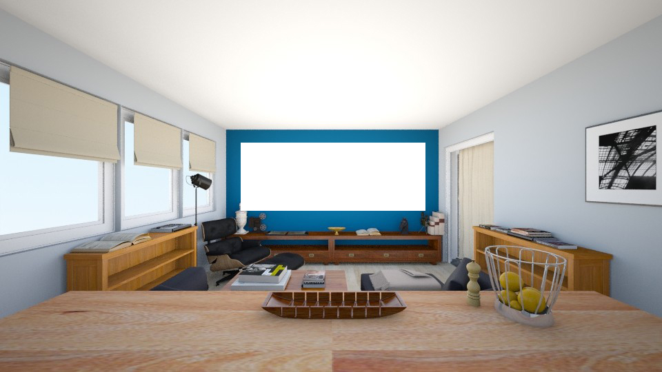
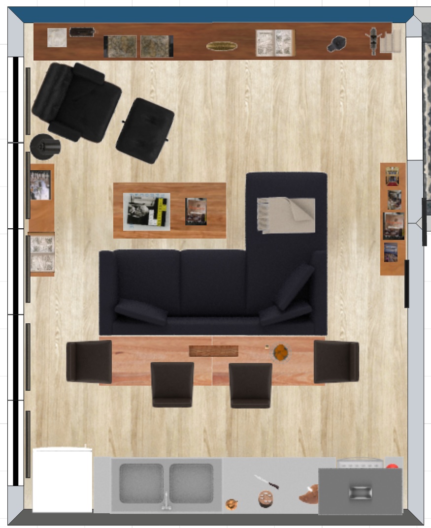
By making these small changes, we ended up with a revised version pretty quickly that fit all his needs :

We wanted to space out the bar stools so they wouldn’t all be on the kitchen side, which would eat-up (pun intended) too much valuable room for cooking, so instead we put one on each end of the bar. The sofa and bar create a block in the center of the room, around which you can walk from either side, so you can access both the kitchen and the stools.
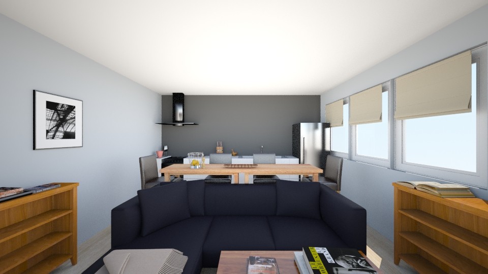 The addition of the bar makes the whole area much more inviting. It’s the perfect solution both for entertaining guests, and for Mathieu to have a good place to sit and eat while watching TV.
Now these renderings were a concept for the layout, but then we had to dig around and see what actual fabrics, colors and shapes we wanted for the room.
I put together a moodboard to reflect our final choices :
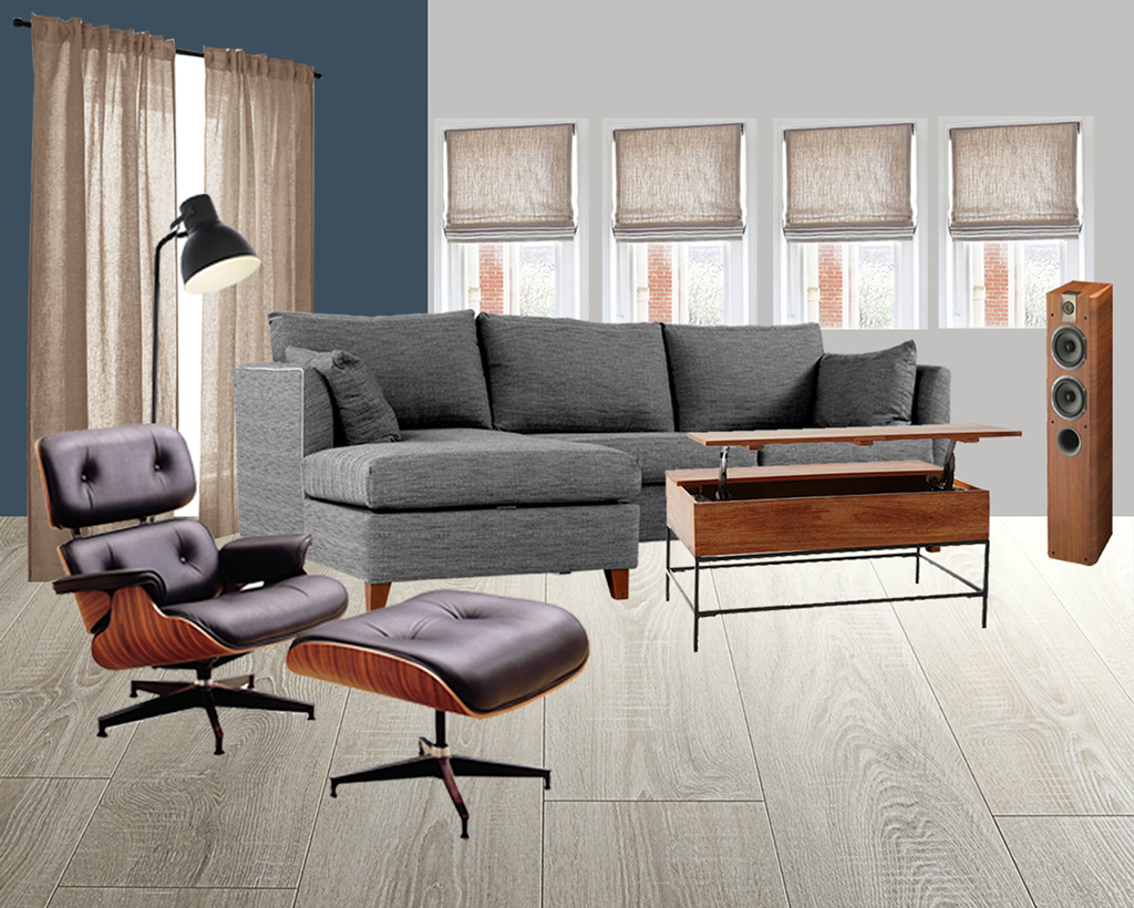 The blue wall is the actual color from the paint can lid, but, as with most colors, it’s very different in real life. It’s bolder but has a lot of depth and captures light in very different and interesting ways.
For the windows and doorway we decided to go with linen all the way. It’s a very warm texture and makes you feel all cosy right away.
There’s a lot of wood around the room, both from Mathieu’s handmade furniture but also the accessories, like speakers. So we’re trying to keep the same tone, mostly inspired by the future Eames chair’s tint, for all things wood. Mathieu’s still pondering whether he’ll make the coffee table himself or if he’ll buy it, but we’re interested in finding a model with storage built-in, to hide the many remotes that lounge about the place.
Finally the sofa is a work in progress, we really like this one from Made so it’s a good place holder, but it’s a big purchase and it’ll be last on the list for now.
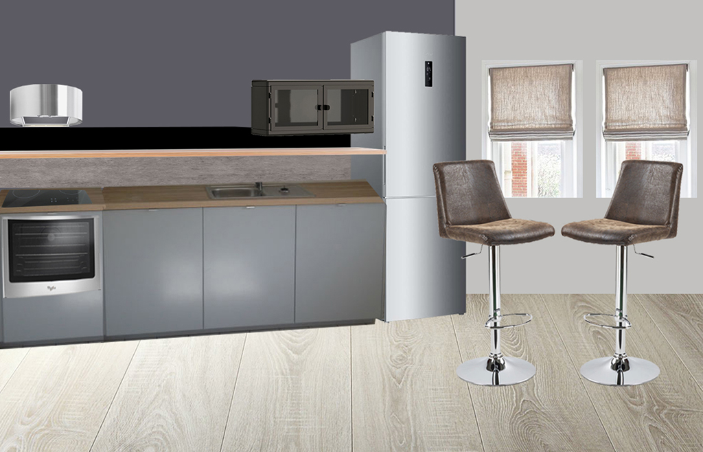 This moodboard for the kitchen will give you an overview, including our bar stool choice (they’ve been ordered !). The kitchen is Ikea and all choices are custom, so I couldn’t include them here, but this is basically what it’ll look like, minus the pulls and drawers.
So as you can see, we’re going full “masculine, modern, elegant” up in here ! I’m all little shocked myself that I’m managing to do this without adding any leopard or bright colors. I think everyone who knows me is too. It’s a big day for all of us!
My client so far is verrrry happy with all of these plans and I think he can’t wait to see his little dark red apartment transformed into a spacious manly grey palace !
I hope this gives you a good idea of what we’re working towards, I’ll start making small updates, reporting from the construction site, during the week for you impatient folks. Have a good week everybody !


