24 Jul Project Mathieu : An Elegant Bachelor Pad in Paris
Hi everyone !
I’m so happy this day is finally here : it’s the reveal of Mathieu’s apartment, totally finished !
You can watch the slideshow above first – if you’re a rebel,
or follow along this little recap from start to finish before you come back to check it out (if you’re new or maybe you just forgot!)
You can also look up the tag « Mathieu » if you want to read all the posts in their entirety.
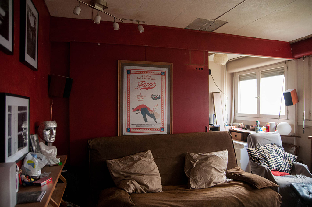
When we started, the space was separated by a half-wall and unused sliding door.
This was the living room side, painted red at the time (with some classic college-age Ikea seating!)
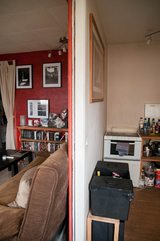
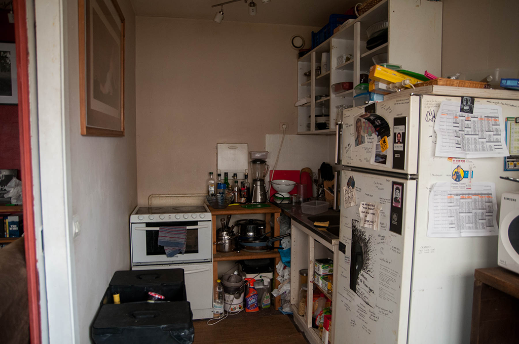
And this was the kitchen side, because of the not-so-great layout, we hadn’t changed anything in there since he moved in.
One of the main reasons we wanted to break the wall, was to unlock the kitchen’s potential.
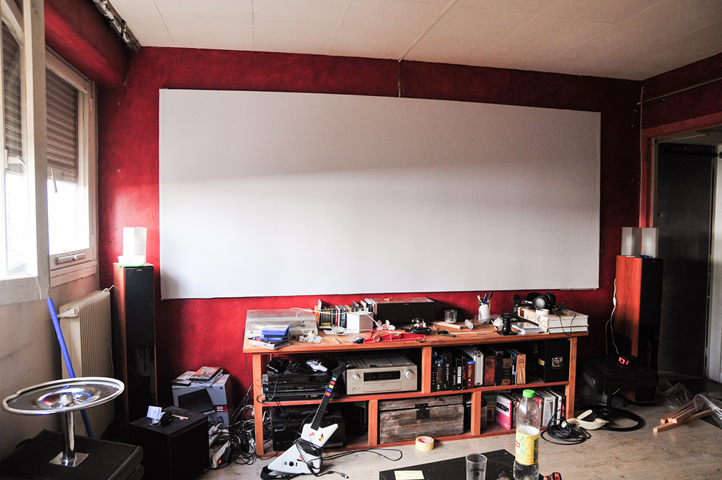
The only wall that mattered before I came along : where the magic happens !
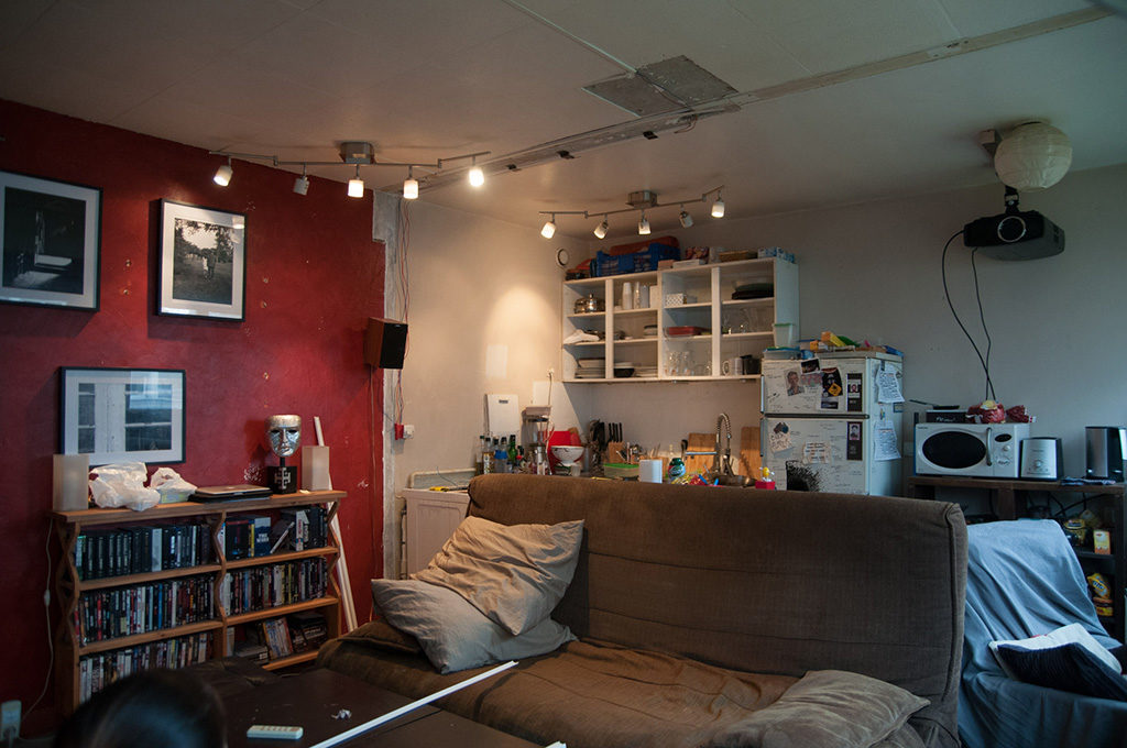
So we tore down the sliding door wall, and opened up the whole space.
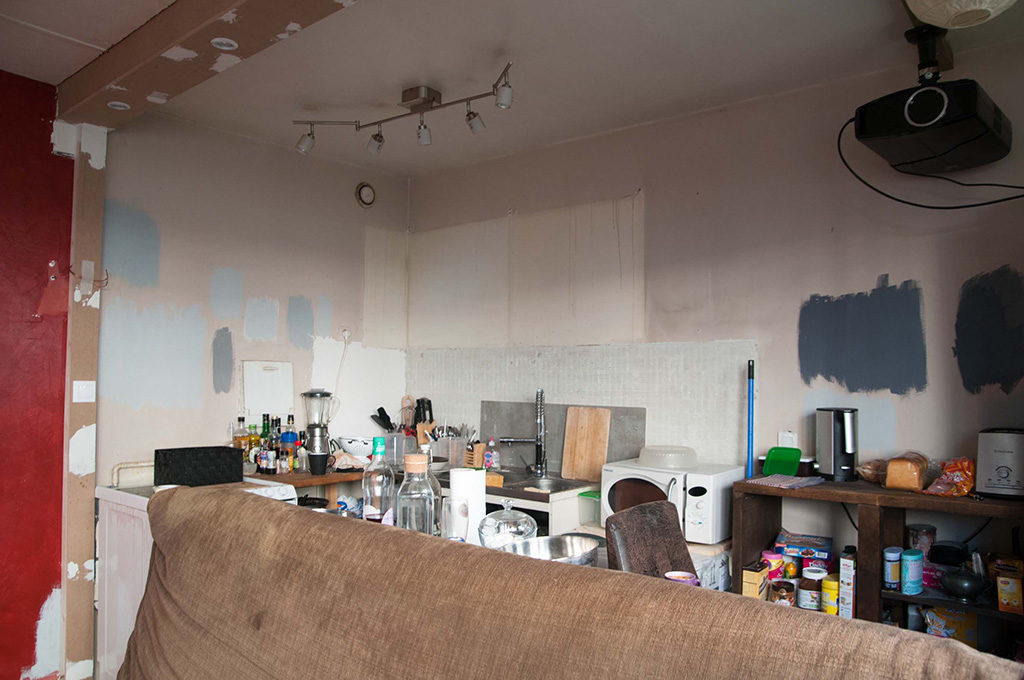
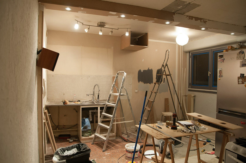
Next, we got rid of these sad little kitchen appliances.
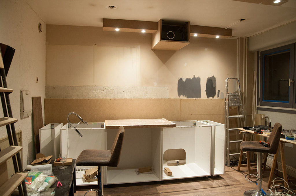
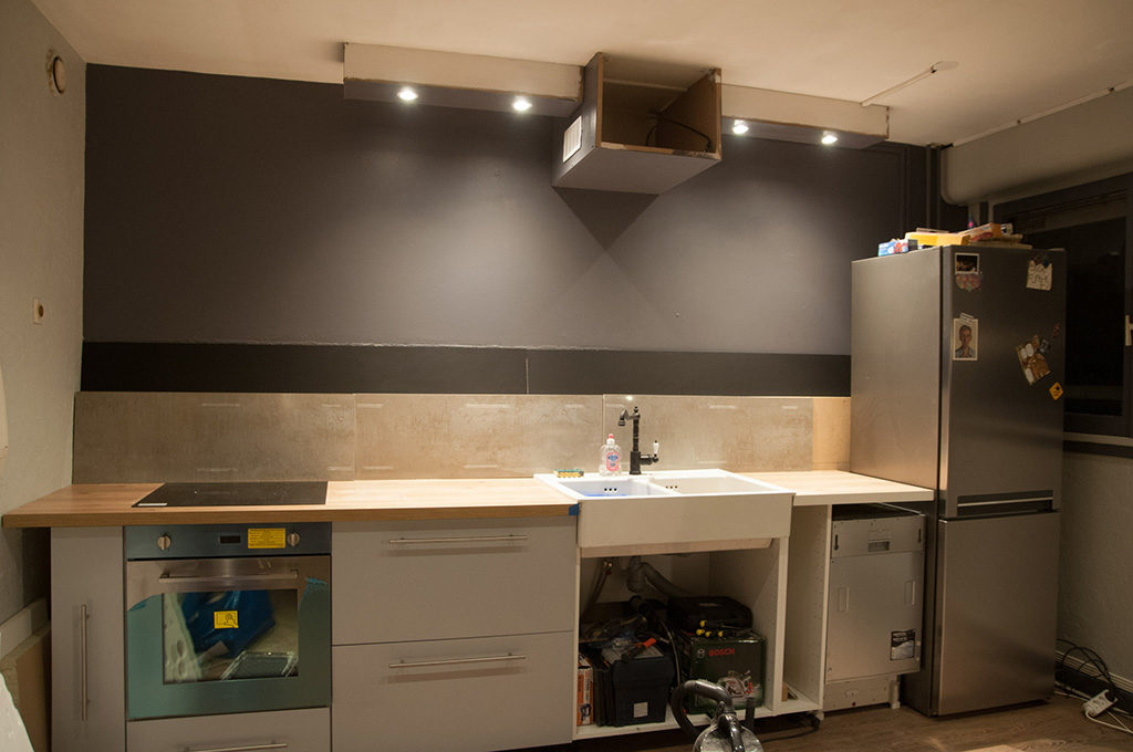
And with a mix of brand new Ikea cabinets, pretty appliances, and a lot of hand-made tricks to keep the cost down, we managed to create a functional and sleek new kitchen, and as a bonus, move the video projector a few feet back !
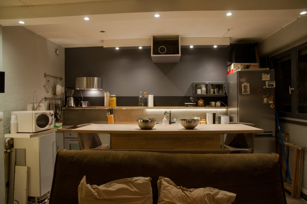
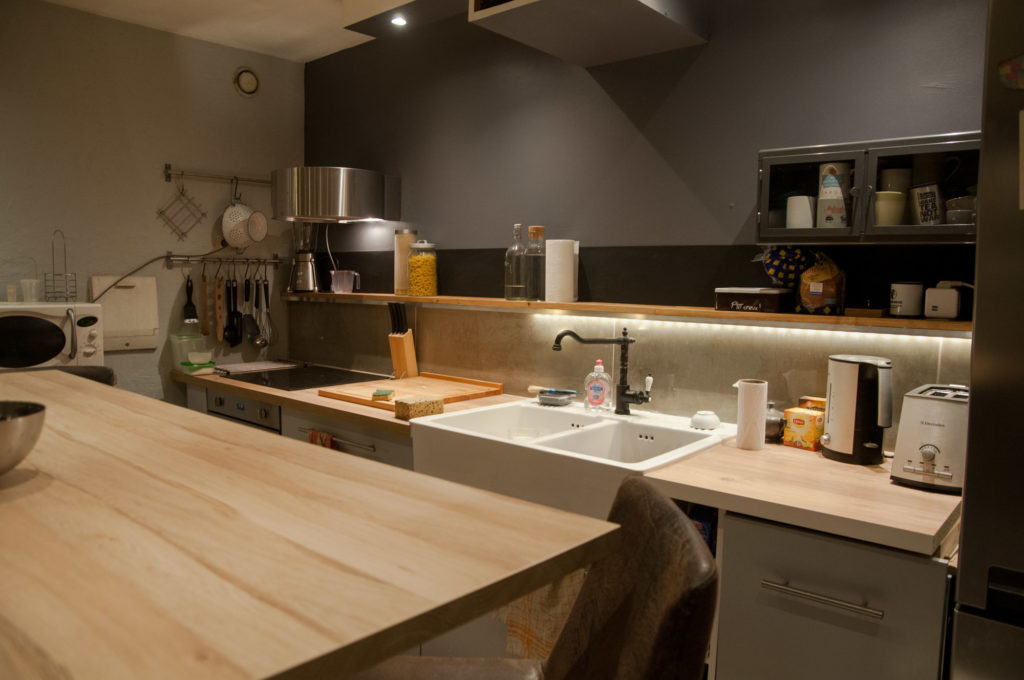
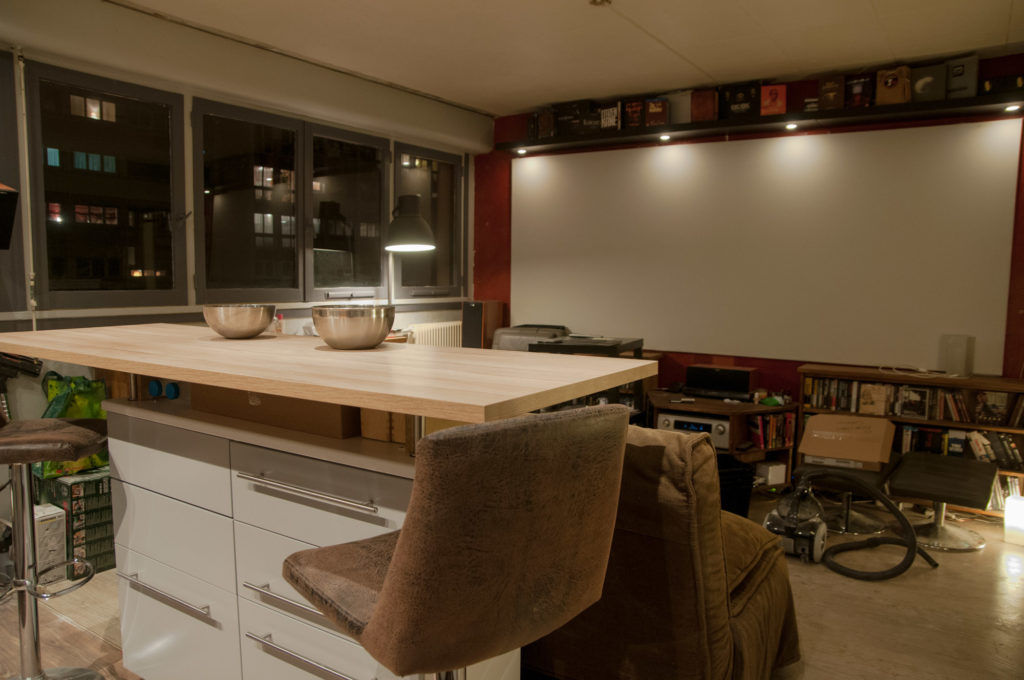
To separate the kitchen area from the living room, we added a very large bar, that also allowed for rows of drawers under it, adding more kitchen storage.
We used a place holder Ikea counter top at first.
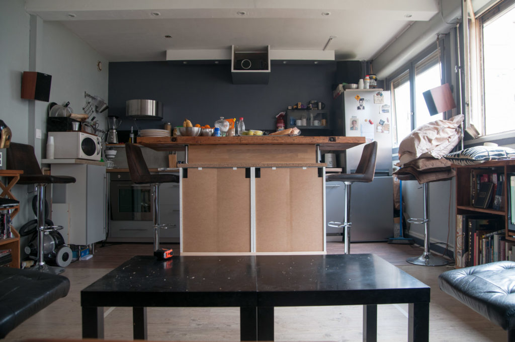
And then added a gorgeous piece of wood – that used to be our grandfather’s work station – as the final countertop.
While we were doing the kitchen, we repainted the whole room, saying goodbye to red, and using a mix of sophisticated grey hues instead.
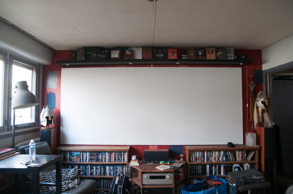
The last piece was the screen wall, where we decided to add some color instead of going for grey.
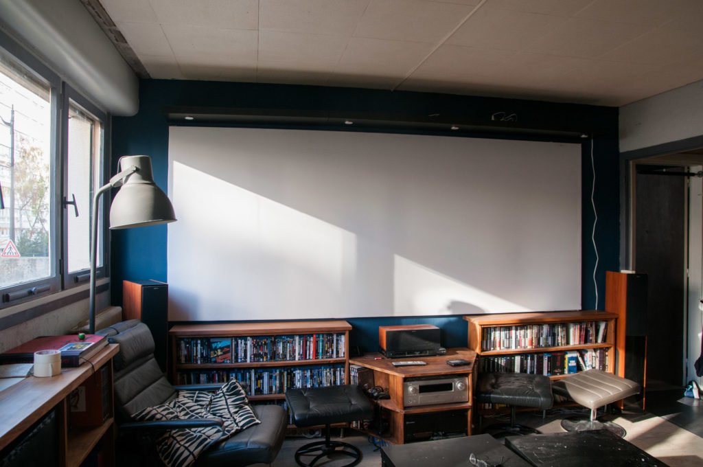
So when all of this work was finished, all that was left was replacing some of the living room furniture. Thankfully we didn’t have to replace everything, since Mathieu had made his own furniture. But once the space was repainted and elegant, the old brown couch and 10$ Ikea tables were looking very out of place.
Thankfully Mathieu wanted to change them as much as I did, and it lit a fire under his butt : before long he had bought a new couch, a reproduction Eames lounger, and had made his own coffee table to fit his needs ! (More clients like this please !!)
The Eames lounger has been his dream for a long time, and I never thought I’d see it in the space this fast, but I’m so glad because it rounds out the style perfectly (and he spends all his time in it!).
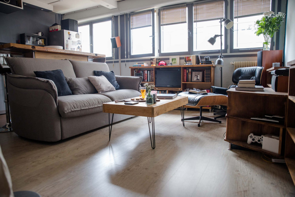
It’s a more grown-up, cohesive, and inviting space, closer to his 30-year old self, than his college-student red living room.
We’ve updated the space, but did so without changing the feel of the room : it’s made for watching movies, and reading a book in the lounger while music fills the apartment. Except now there’s a place to cook and eat properly, and a better layout to have people over.
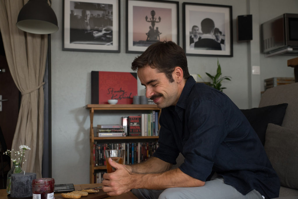
Mathieu is very happy and at home in this new space, and I didn’t even have to put leopard anywhere in the room. Total win-win !
I did bully him into adding some accessories, like candles and throw pillows …
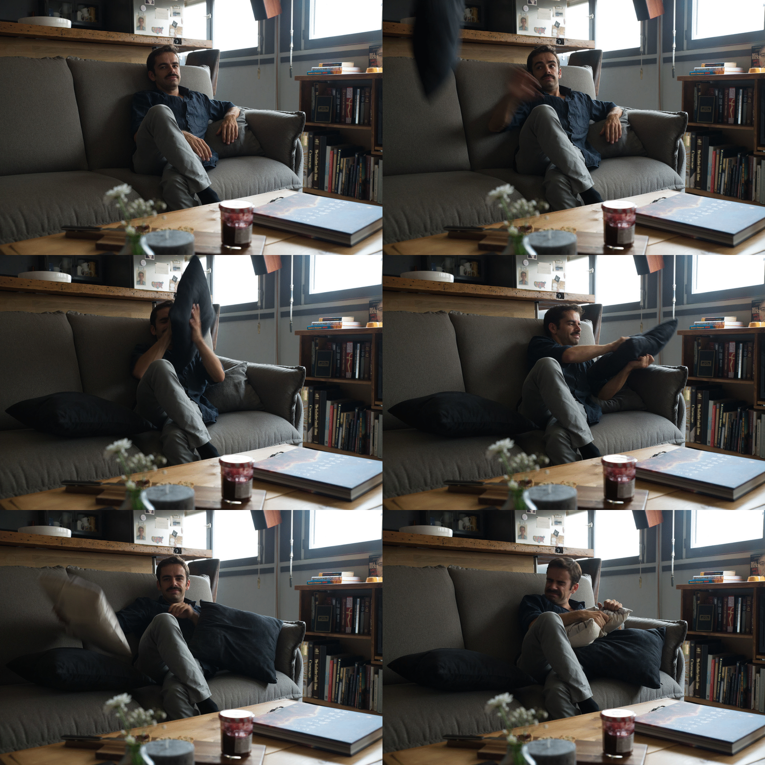
Which he pretended to hate it but wouldn’t let me take them back to the store. I still can’t convince him to buy a rug though…
Go check out the gallery slideshow at the top of the post, if you haven’t already, to see more pictures of the finished room !
Guys, I had so much fun doing this project, it’s a total departure from my usual over-the-top style, but with a client who knows what he wants, it was a breeze, and I’m so incredibly happy with the result !! I hope you like it too, let me know in the comments 🙂
Alright, that’s a wrap on Mathieu!
