18 Sep Design of the Week : Elvira’s Dream Boudoir !
Today I am delighting my inner goth – and I hope yours too – and sharing one of my recent projects that was suuuuch a blast ! My client and I started talking and I can’t even tell you how excited I was when the subject turned to horror movies and music she liked and how her bedroom and sanctuary were about to become a deliciously dark boudoir with nods to vampires and Evil Dead …

Now, I have the great fortune of attracting very fun clients and getting to do very funky, fun and wild designs all day – but there is nothing more fun than finding out that my clients and I are into the same things : I was a goth kid in high school and I too, have Evil Dead art in my home, and this was a match made in hell (lol). I had already picked out most of the items before our conversation was over 😝
I like to explore two different vibes when we start a project, just to shake things up, give the client a different option
and sometimes even lure them out of their comfort zone. My client here knew her style pretty well already
– lots of humor and off-beat fun accessories, but also a general sexiness reflected in the space – so for this room,
it was just a matter of finding the balance between dark, sexy and fun.
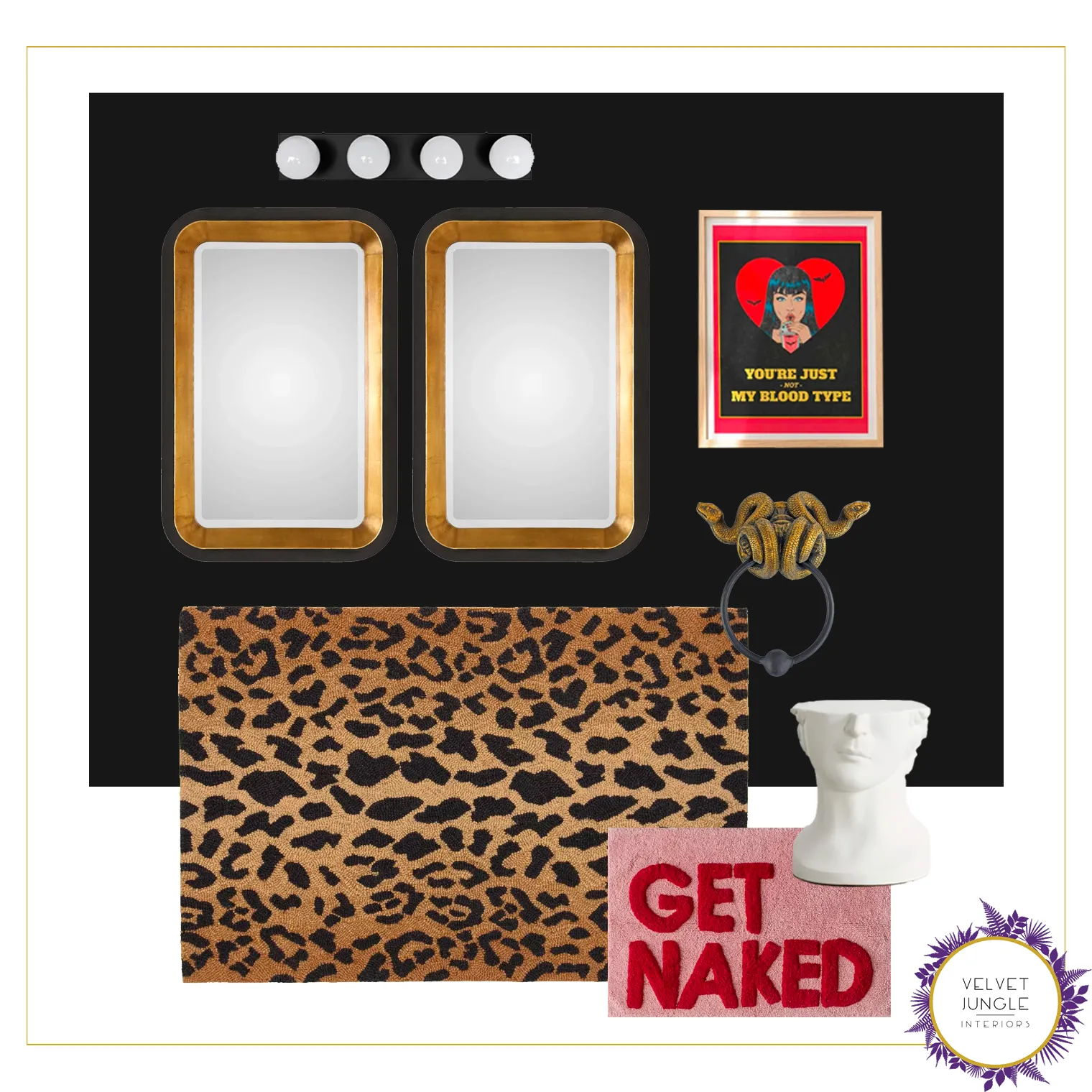
The space includes a large bedroom with a desk set-up, and an en suite bathroom. There were a few existing
pieces already so I leaned into making them work for us. Check out the looks below !
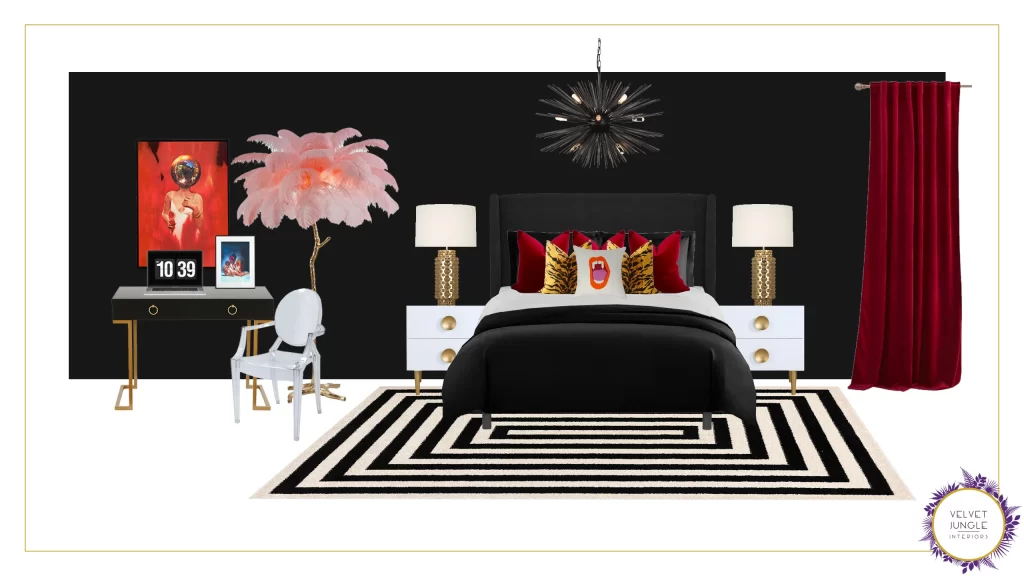
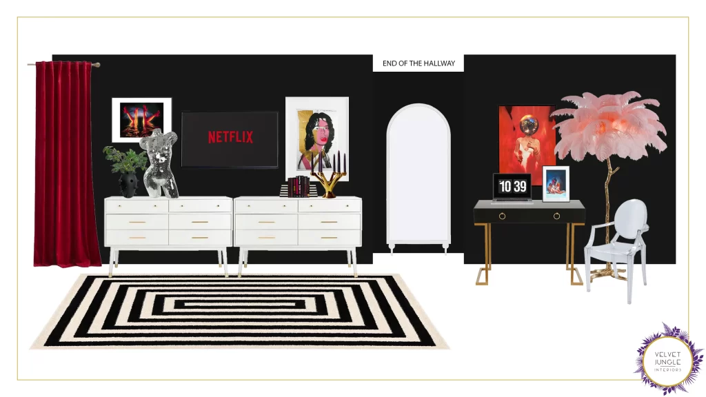
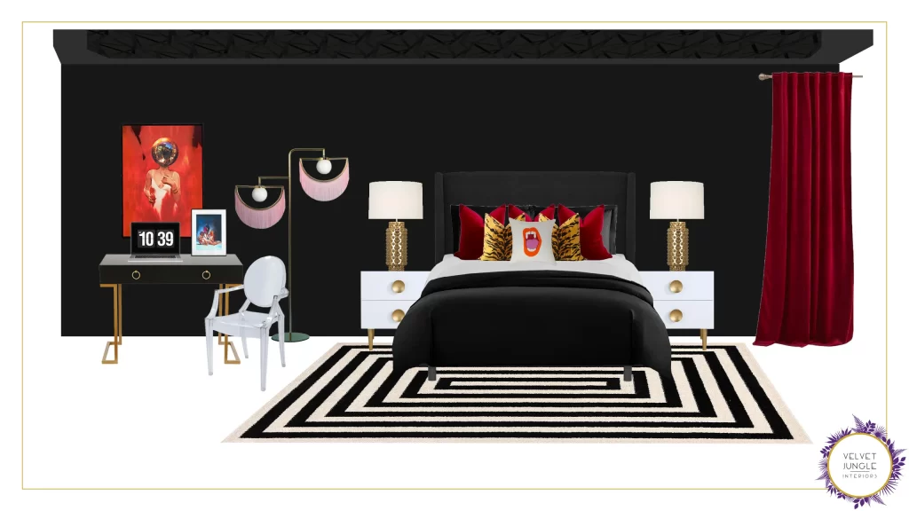
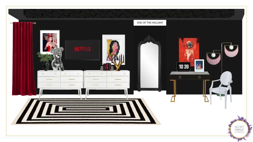
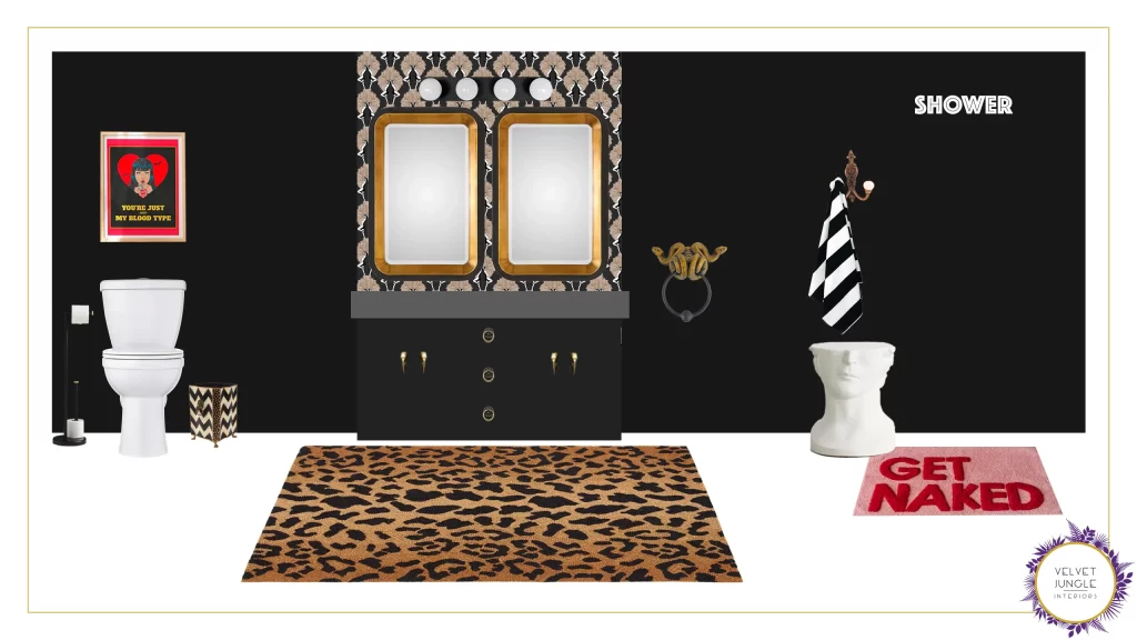
Look 1 :
So first up, I went for a bold and sexy look in a very modern vibe. To me this feel like Elvira’s 2023 fun bachelorette pad : lots of funkiness and off-beat touches, and nods to the vampire and goth elements but in a feel good package.
Guaranteed to make you smile before you go to bed every night !
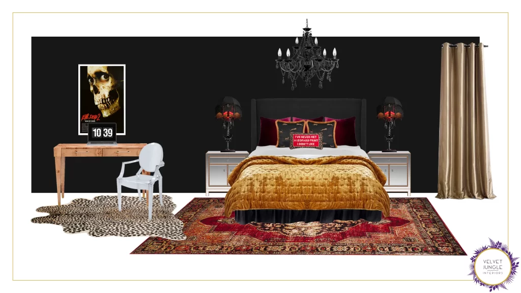
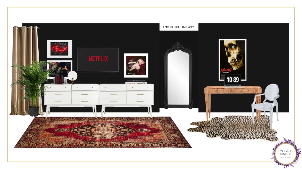
Look 2 :
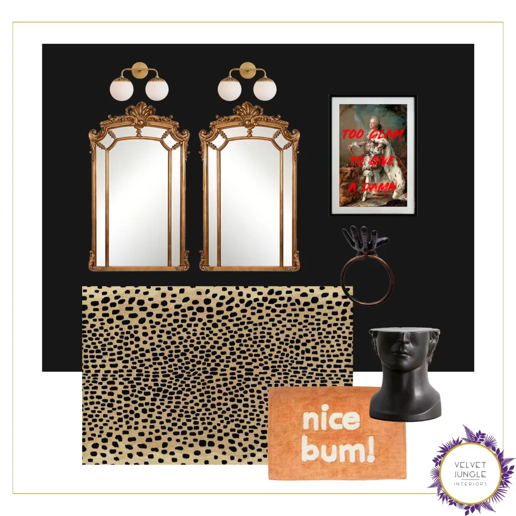
This one in contrast veers a bit more into the sexiness, in a classic glam-goth look, fit for an updated castle
and its gorgeous mysterious owner ! We still have some off-beat and fun spooky pieces here and there,
lifting up the more classic elements, but not overshadowing the general vibe or its sexiness.
Much to my delight, it seemed I hit the nail on the head and my client was torn between these two clear facets of her personality.
After a little soul searching for her true favorite, the first look won out and we started in on the tweaks.
Although there weren’t many, the woman was in love 🥰
We ended up switching out the hallway mirror – to include the one from Look 2 -, a piece of art, and adding wallpaper to the ceiling and the bathroom wall. The one big change was the feather lamp, while it was a big favorite sadly we weren’t able to keep it, so a little swap for fringe instead and the stage was set for her new dark and sexy life to begin !
Here is the final look :
Now while you’re envisioning this fantastic sexy new space, trust me when I say that this will be a huge transformation for my client, whose “before” room was the dreaded, classic American builder grade that fuels my nightmares : gray walls, carpeting, no features and little light. It felt weirdly claustrophobic for such a large room, and the layout was cutting the flow. It’s now about to be the sexiest space in her house, a haven that reflects her personality fully, the windows will look bigger, the space will seem more substantial and her bathroom is guaranteed to make her feel like a damn rockstar every morning.

What about you ! Does this speak to your inner goth ?
Can you spot the little secret references we put in there ? Share your thoughts in the comments 🤘
— Marie


