Happy New Year !! It’s official, I am back to work this week after a long break of visiting family and friends, traveling through the country to see everyone. I got back home a few days ago and I’ve been possessed by the spirit of the new year, getting rid of a lot of crap at home, re-organizing like a mad woman and planning a hundred lists for the coming weeks ! I don’t think I’ve ever been this pumped about a new year lol, but I’m getting all kinds of good vibes from it and feeling very energized to create, work, and level up in general. Is this what adults feel like most of the time ? I was more of a “let’s stay under the covers a little longer” kind of gal until now …. 😅
I’ve been working on some big projects that are going to take some time until I can unveil them but I still wanted to start the year off with a little behind the scenes look at an e-design project because it’s been a while, so I picked one of my favorite recent ones, a dark sexy bedroom I designed at the end of the year for a fantastic new client !
She wanted to kick off 2023 with a “New Year, New Me” attitude, taking back her space and making it all kinds of fabulous. We started with a space full of clutter, which she hated, think extra gym equipment, unsightly stacks in the corners because she didn’t have enough storage, the kind of thing that happens over time when you’re overwhelmed, or don’t have enough time to take a good whack at it, things were literally piling up !
The room is pretty standard in size, we have a bed and two nightstands on one side, and a TV on the opposite wall with a console underneath. On the side of the bed though there is a little recessed nook, so we decided to repurpose that and either do big storage, or a makeup station with a little wallpaper to make it pop. The walls were a dark green, which looked like a pretty shade from what I could see, but not what we were going for, and most of all, this lady deserved a real change so I thought let’s switch it up either way 😉
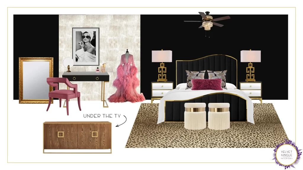
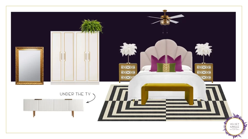
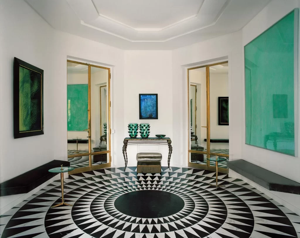
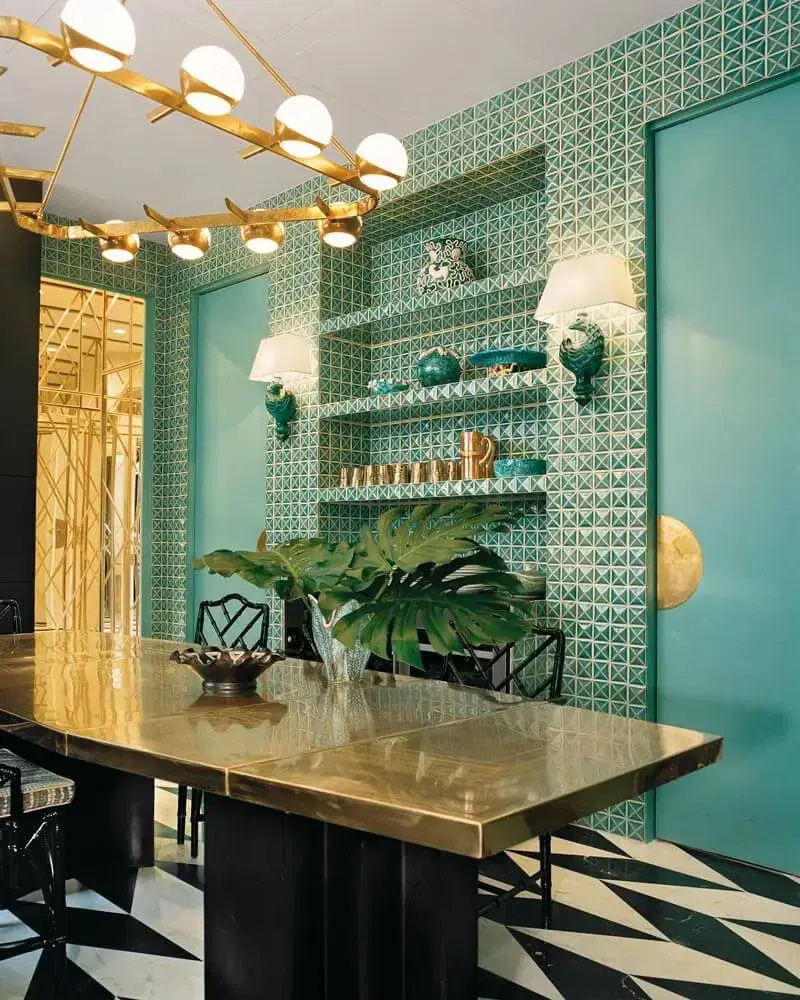
Our first goal was Art Deco – she loves old Hollywood, so with a little modern twist to it, we could really lean into that and make her feel like a movie star whenever she walked into the bedroom. I gave her two options to start :
Look 1 : For the first look, I dove in hard : with a full makeup space and mannequin spot for a frilly robe (well, THE frilly robe), we got metallic wallpaper in the nook there for added drama, washable leopard rug, this fabulous wavy bed and mirrored nightstands mixed with greek key table lamps ! And let’s not forget the delightful fringed ottomans in cream velvet to round up the look…
Look 2 : For the second look, I wanted to gauge her level of modern acceptance so I did a “take” on Hollywood regency. I went for a double armoire filling up the nook space, mirrored nightstands with a lot more gold and funky details, matching them with ostrich feather table lamps, a very modern deco bed in delightful blush pink, adding soft, inviting colors to the pillows and bench for a fun, fresh look, and bold rug from Jonathan Adler (the master of Hollywood regency design 😎). I also slightly adapted the wall color here, it’s subtle but it’s actually a very dark purple color – it brings the sexiness but adds a little extra warmth.
Now this is the reason I like to show the process behind the scenes because
you will be very surprised at what becomes our final design from this starting point !
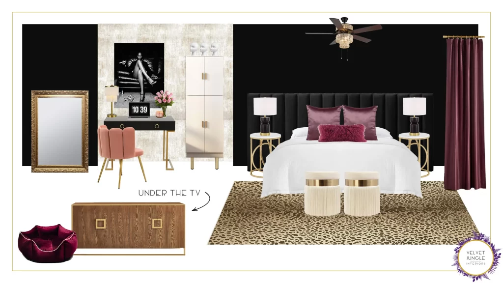
We discussed the items that she liked and those she didn’t and from there started tweaking things, moving toward our end goal. Starting from the first look, her favorite of the two, she really loved the vanity desk, but we still wanted storage somehow, so we split the difference and created an area that was half desk, half wardrobe. We also changed the bed to something a bit bigger and bolder, and swapped Audrey for something waaay sexier – this is the first look at changes :
So as you can see, we’re not too far off from Look 1, and on paper this seems to hit all the wants we started with.
But this is the where the magic happens folks ! Sometimes when clients see what they wanted all put together like this,
they realize maybe what they had in mind isn’t quite “it”.
She told me that maybe Art Deco was holding me back, and she wanted to see what I would do with the space instead. So we started talking about the vibe, and it turns out what we should have been aiming for was Lenny Kravitz meets Prince all along !
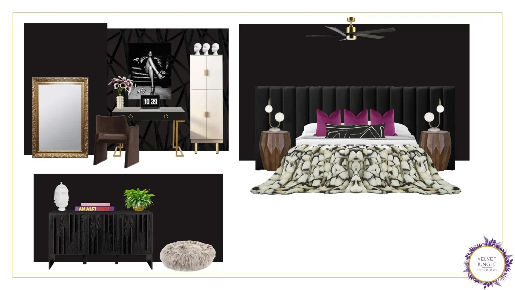
To this I said “hold my beer, honey”, and gave her a secret third option just to see if that scratched the itch. If not, we’ll go back to the previous look and work it a bit more. This is what I sent her :
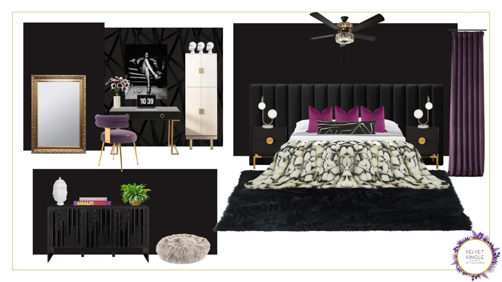
And well you guessed it, this one hit the spot 😍 It’s modern, earthy, textured, chic yet still casual, and sexy as hell.
I was drooling over it and so was she ! We decided all we needed was to add a little more Prince by peppering in more purple throughout the space and made a few tweak and BAM, done ! Stop the presses, pack it up, it’s perfect.
There she is, I give you : the sexiest bedroom in all the land 🙌

Rawr indeed ! 🤩
Now this is 100% why I love my job right here. Anyone who’s remotely interested in design gets bombarded with inspiration
all the time and on paper, things might seem like your style or make you want to copy an existing room, but 9 times out of 10
with my clients, once we start working together we really open things up to find the true personality
they want to bring to the space, and how to make it their own.
And that’s the part that makes me really happy, firing up the design lab and creating something
to fit not what you thought you wanted but what you reaaally wanted all along ….
… A bedroom where you could invite Lenny Kravitz 😂. Don’t we all ? (This is rhetorical lol)
I had so much fun with this project and I’m so happy with the fabulous end result and so grateful to my wonderful client. The thought of her starting the new year like a badass in this insanely cool bachelorette boudoir, just gives me all the happy feels.
A fabulous year guaranteed, I say !
I hope yours has started off fantastic as well, and here’s to another year of amazing design inspiration, unique shopping ideas, and amazing projects on this blog ! And if you need a badass room for the new year too, you know where to find me !
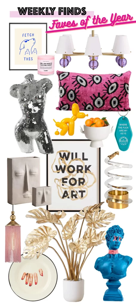
See you all Friday for our first Weekly Finds of the 2023 !
— Marie
