Spotlight On

Spotlight on : Fearless Set Design from the “Harlem” TV Show – Vol.5

April 1, 2022

We made it ! Today is the final day of the Harlem TV Show home tour extravaganza !
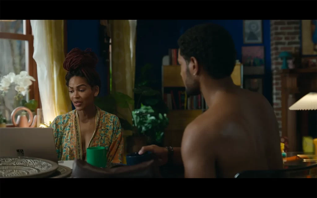
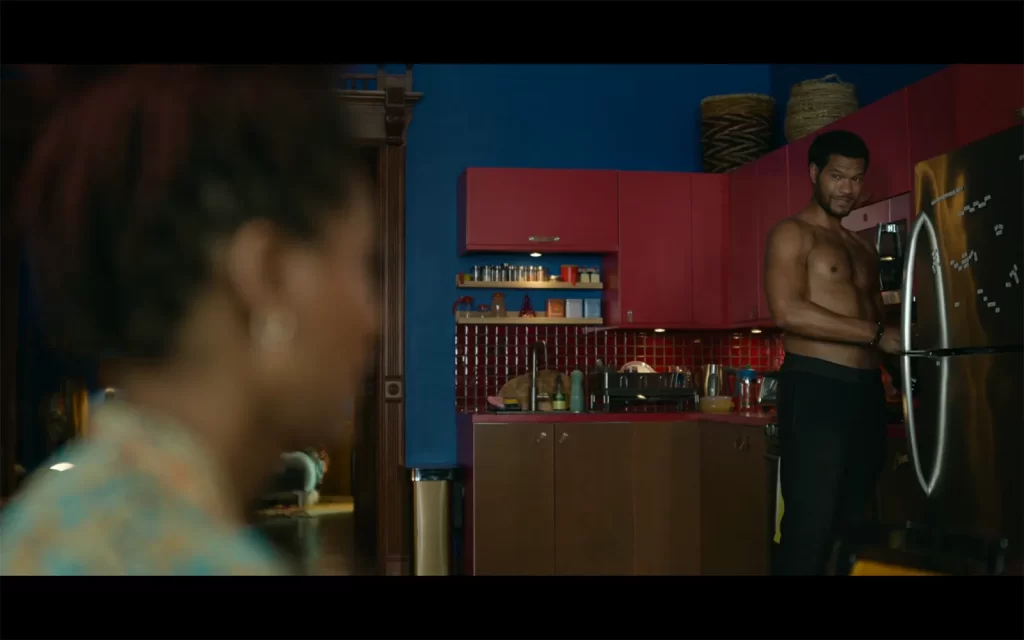
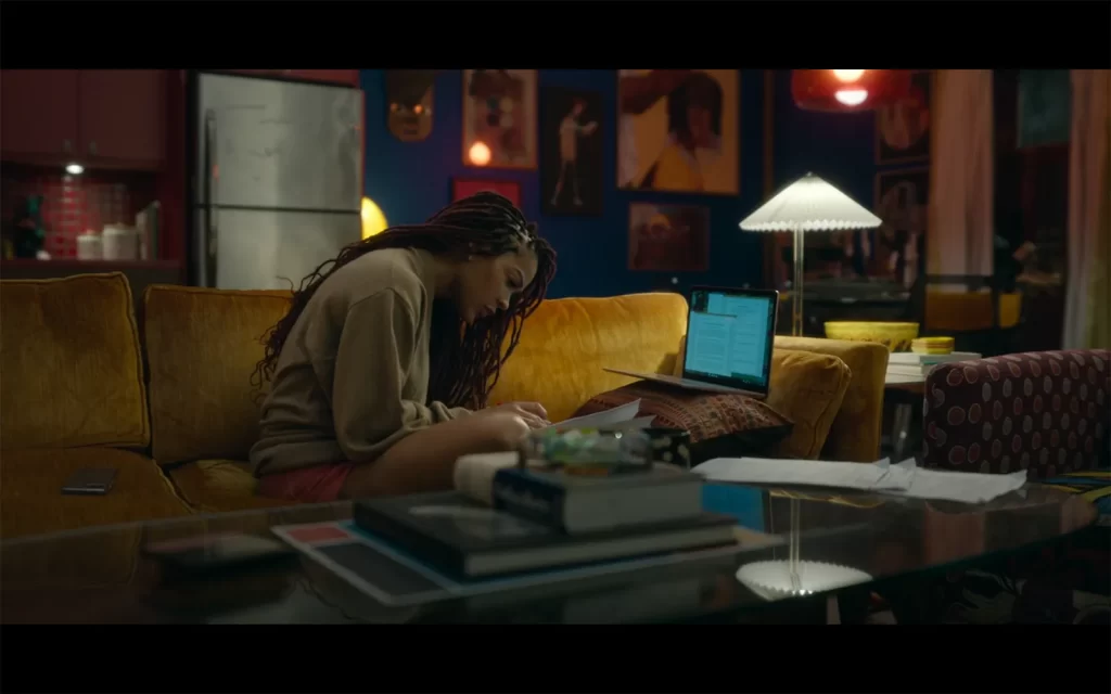
And I saved the best for last of course, Camille’s insanely cool apartment. The palette is bright primary colors only, a mix of blues, red and yellows throughout the entire apartment and it. is. glorious.

Let’s take a look at the living room, rife with the coolest art imaginable of course, because this lady has some serious taste, note the golden sofa. Drool.
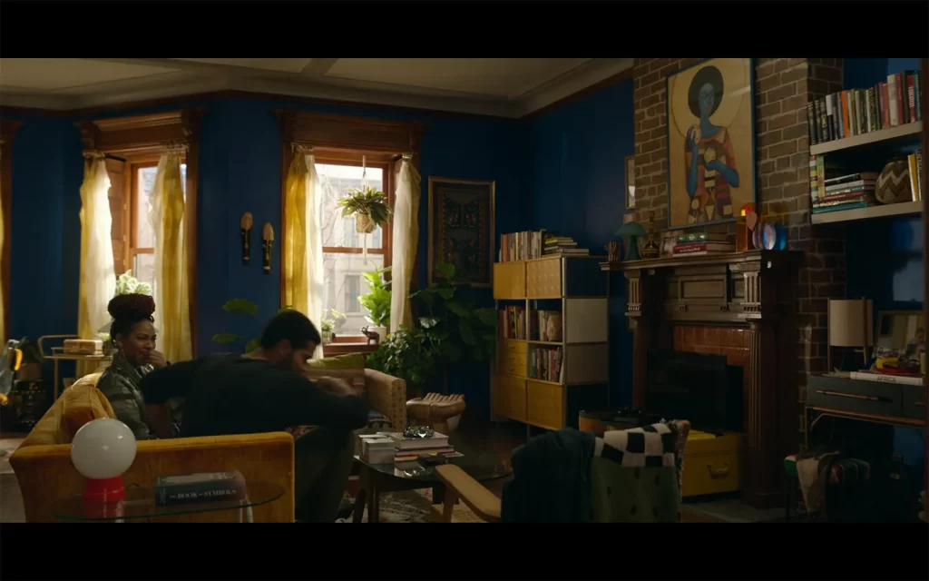
A close-up look at the art from Javiera Varas’ website :

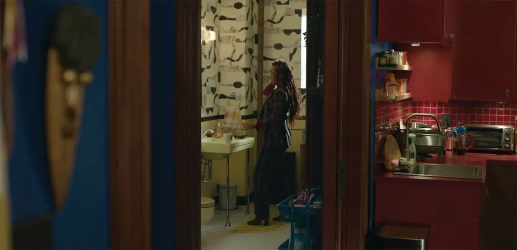
Behind it, a bold full-on red kitchen with matching tiles clash with the bright blue walls in the best way possible.

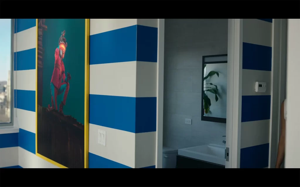
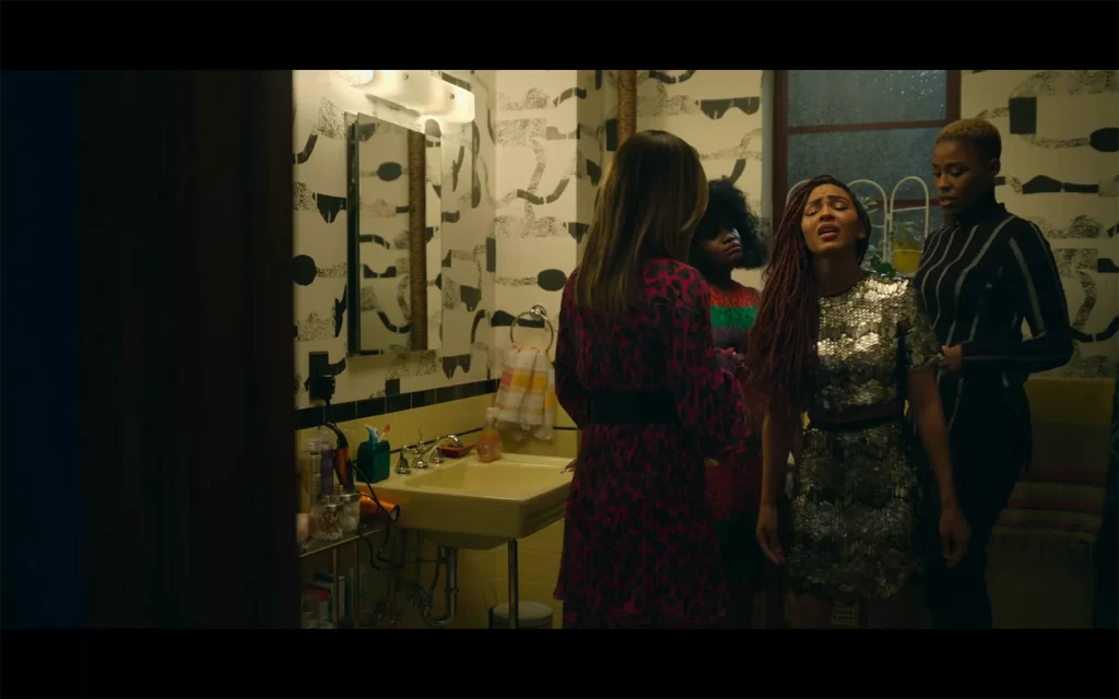
We also get a peek at the bathroom and its fabulous wallpaper, with light yellow tile below and a matching black border probable remnants of the original construction, a nod to the classic architecture of the apartment.
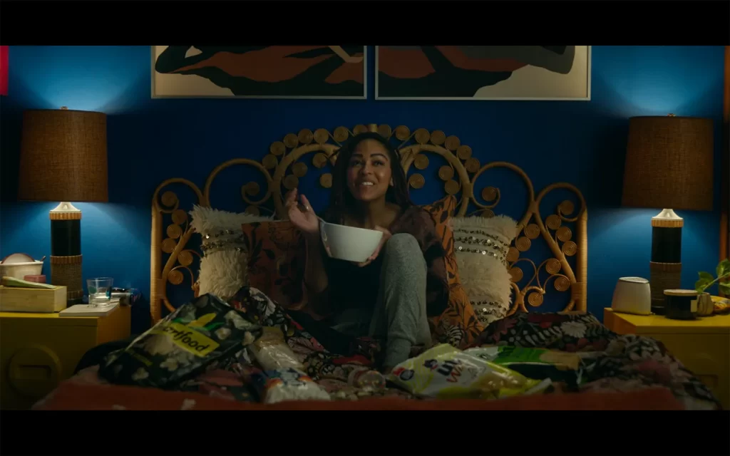
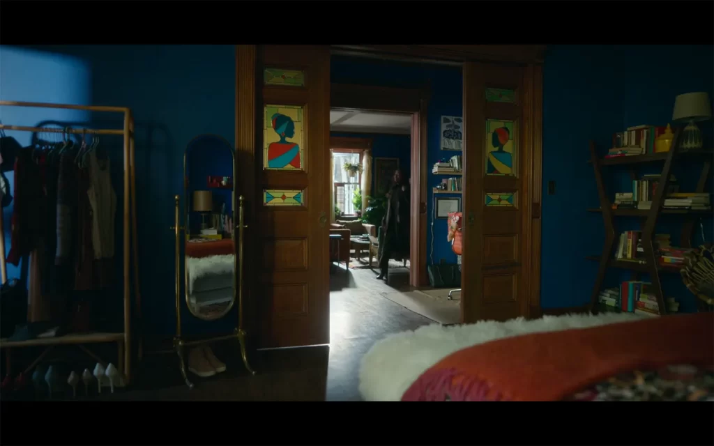
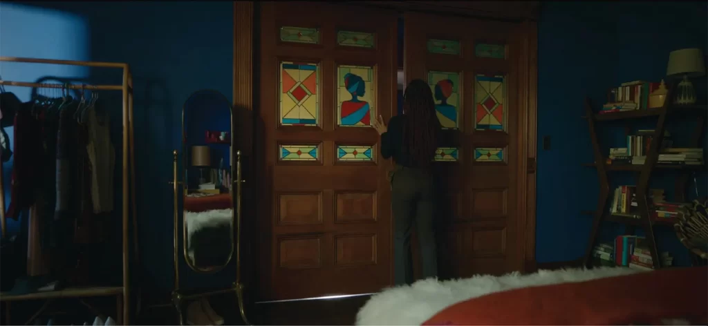
And finally we come to the bedroom, in all its electric blue glory. The essence of boho glam chic right here ladies and gentlemen !
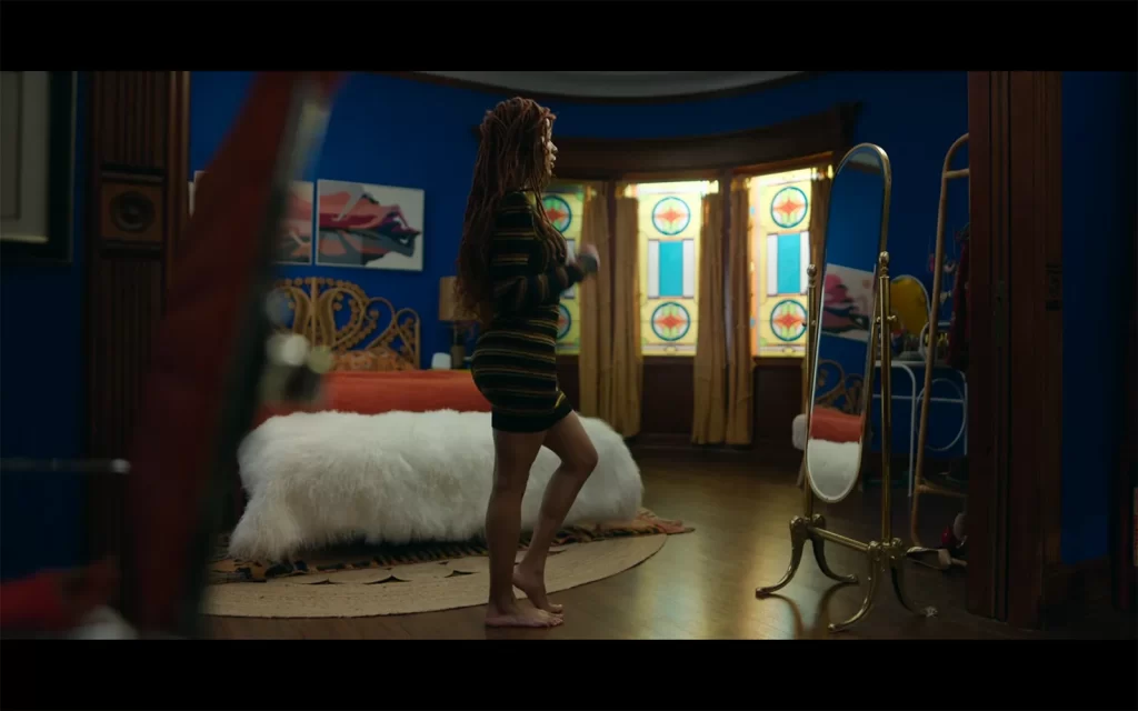
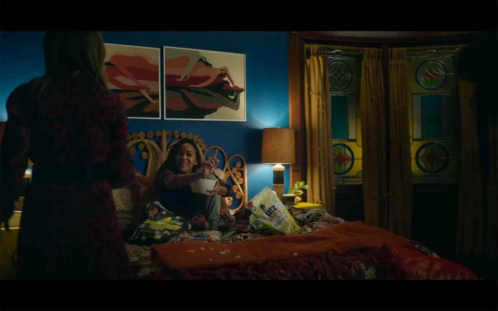
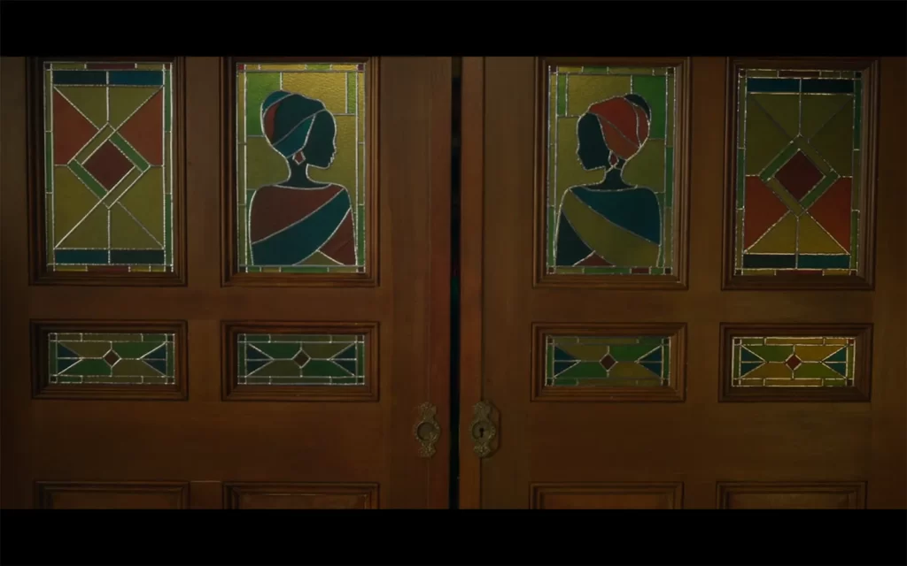
My favorite touch in this beautiful room, and it was also featured quickly in Quinn’s apartment, is the creation of custom glass panes, here depicting african silhouettes on the pocket doors. The level of detail floored me.
I loved this apartment so much, I had to end on a final board for the bedroom, go for it !
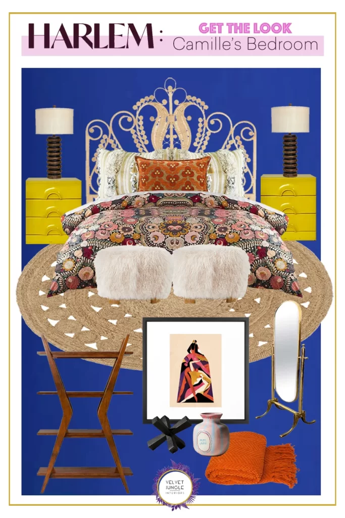
Shop the Look Below :

I had so much fun going through these spaces and recreating them, I hope you did too and if you’re looking for a cute new show, this is the one – the fashion is of course on par also so you won’t be disappointed 😉

Make sure to go look over all the previous posts chronicling the other spaces, see part one, two, three and four, and check out the fabulous designer behind this incredible work, Javiera Varas.

Happy weekend !

— Marie

Spotlight On

Spotlight on : Fearless Set Design from the “Harlem” TV Show – Vol.4

March 31, 2022

Are you up to speed on Harlem week ? See the previous posts here : part one, two, and three.

Today we’re doing a little palette cleanser before we dive in to our main course : Camille’s place – so instead I’m rounding up some spaces that are seen here and there for a second, where you can still spot some delicious vibes 😉

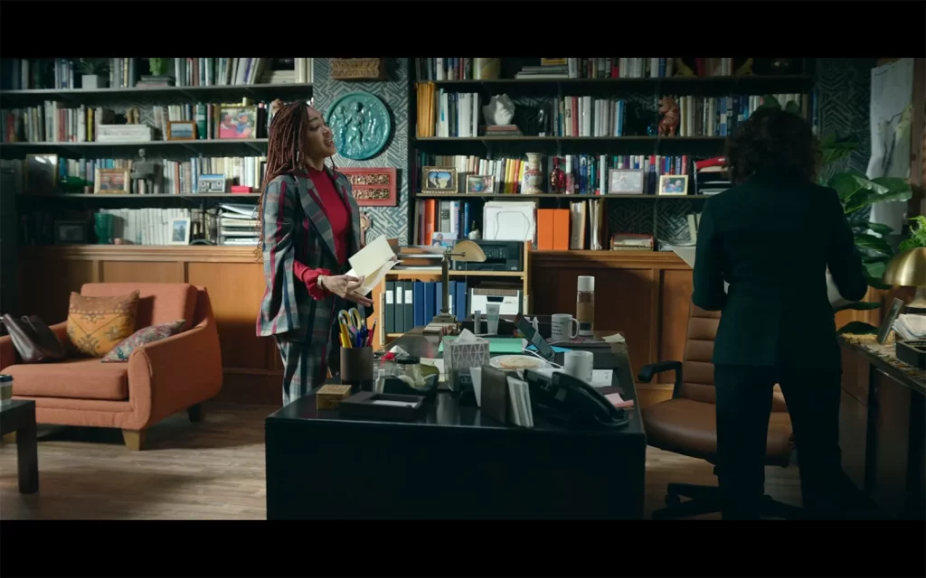
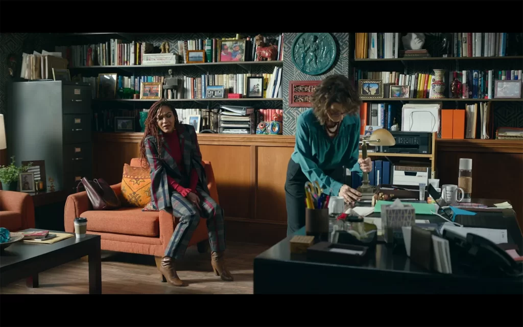
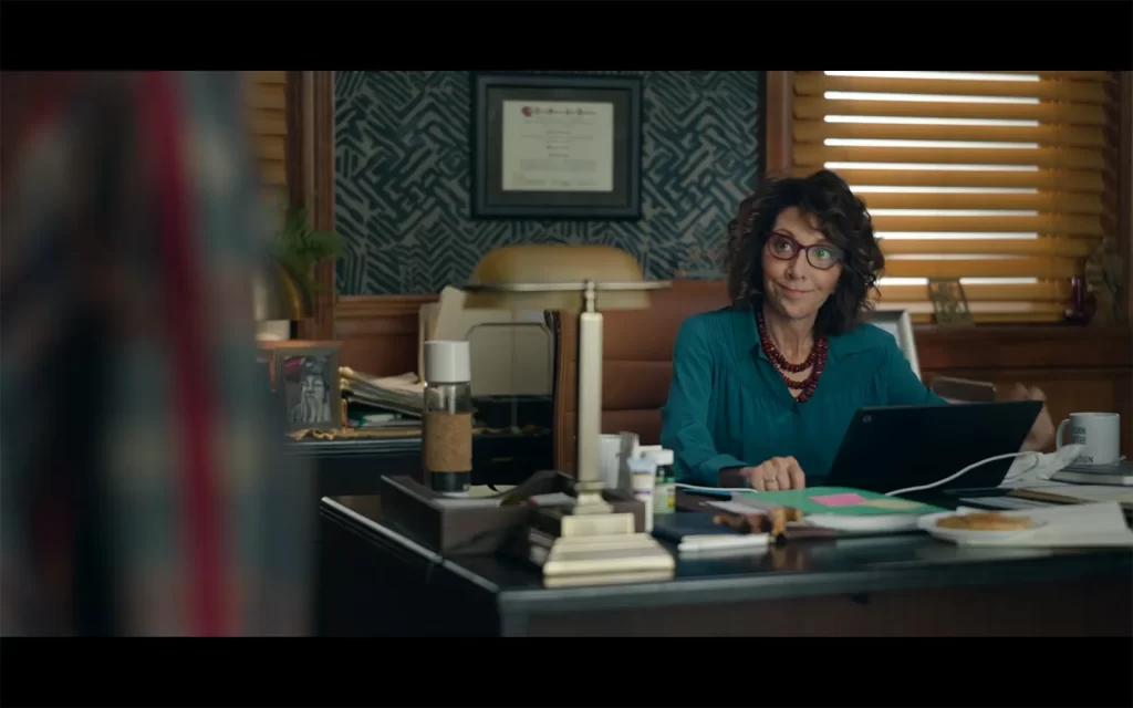
In the first episode we see our main character Camille visiting her boss’ office at Columbia, and I really loved vibe right away, it feels so lived in and has subtle nods to anthropologie, I’m just fascinated with the detailed work of the production design. Bravo !

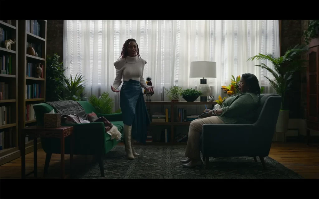
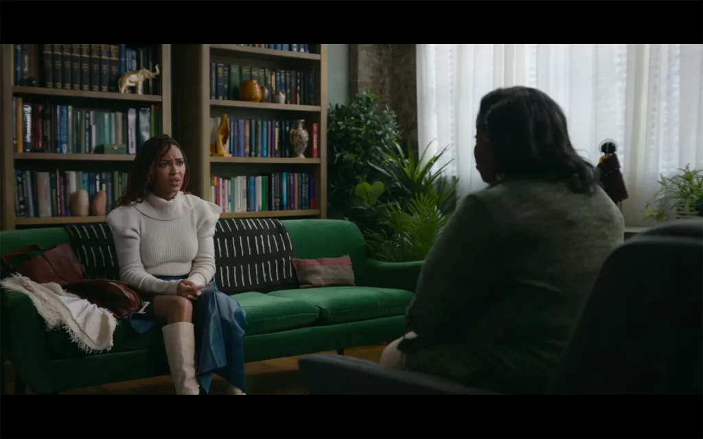
Later on, we follow Camille to therapy and no therapist has ever decorated their office this well, no notes ! This is the perfect modern boho chic look, cold nature tones all over and plants galore, it’s super inviting and very calming.

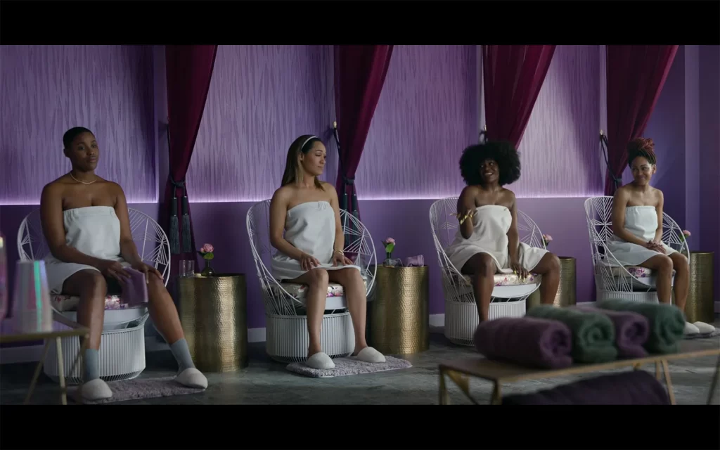
Towards the end of the season we see the girls at the spa and I loved this color combo, very vivid !
Also shout-out to the classic super cheap target tables !

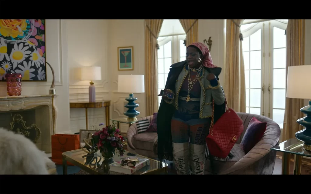
And now sadly we only see this space for a minute in a flashback but I of course loved everything about it : Angie’s crash-pad during her rise to stardom. Like her at the time, it’s crazy over the top, there’s giant faux fur chairs, and a beautiful glam eclectic mix gold, texture and lots of happy colors ! She gets kicked out before we can get a tour but maybe next year – fingers crossed !

We’re almost through our recap of the season, tomorrow is the big one, so keep your eyes peeled !

— Marie

Spotlight On

Spotlight on : Fearless Set Design from the “Harlem” TV Show – Vol.3

March 30, 2022

Welcome back to Harlem week, still going strong for Day 3 !

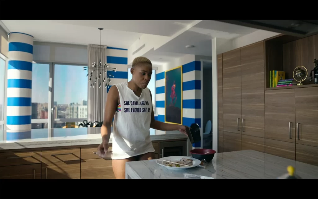
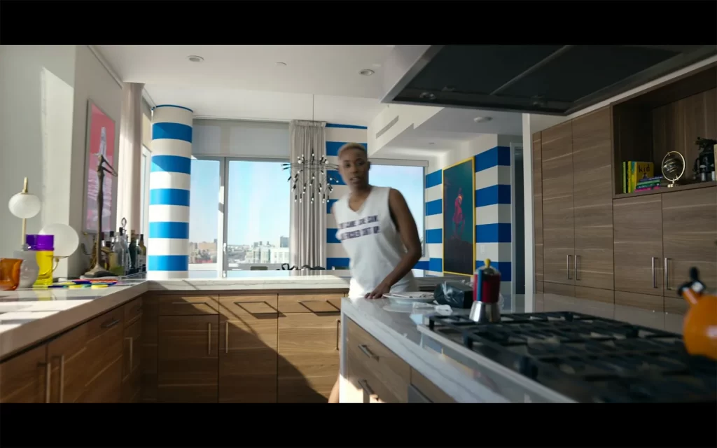
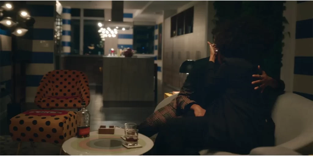
Today we’re touring Tye’s place : she is the undeniable cool chick of the bunch and the most mysterious one at that – which is why of course, we only get two quick shots of her living room and that is a huge bummer. Tye’s got style for days and a very strong personality with a masculine/feminine balance so it’s no surprise her main room is so bold and modern, a departure from the rest of the girls.
It’s like “in-your-face minimalism”, a concept that makes me very giddy. Take a look :

*(Disclaimer : I pulled some images to share on my own but some of these are from Javiera Varas’ website )

That striped column is the cooooolest !
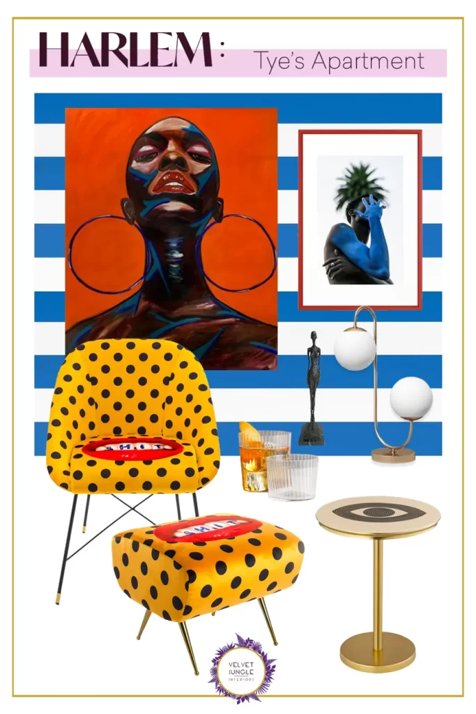
Sadly, it’s not a whole lot to go on – and I hope we see more of it next season – but I couldn’t resist making a board, so with a little improvisation, here’s how you can bring her ultra-cool vibes to your place :

Shop the Look Below :

This website uses cookies and asks your personal data to enhance your browsing experience. We are committed to protecting your privacy and ensuring your data is handled in compliance with the General Data Protection Regulation (GDPR).