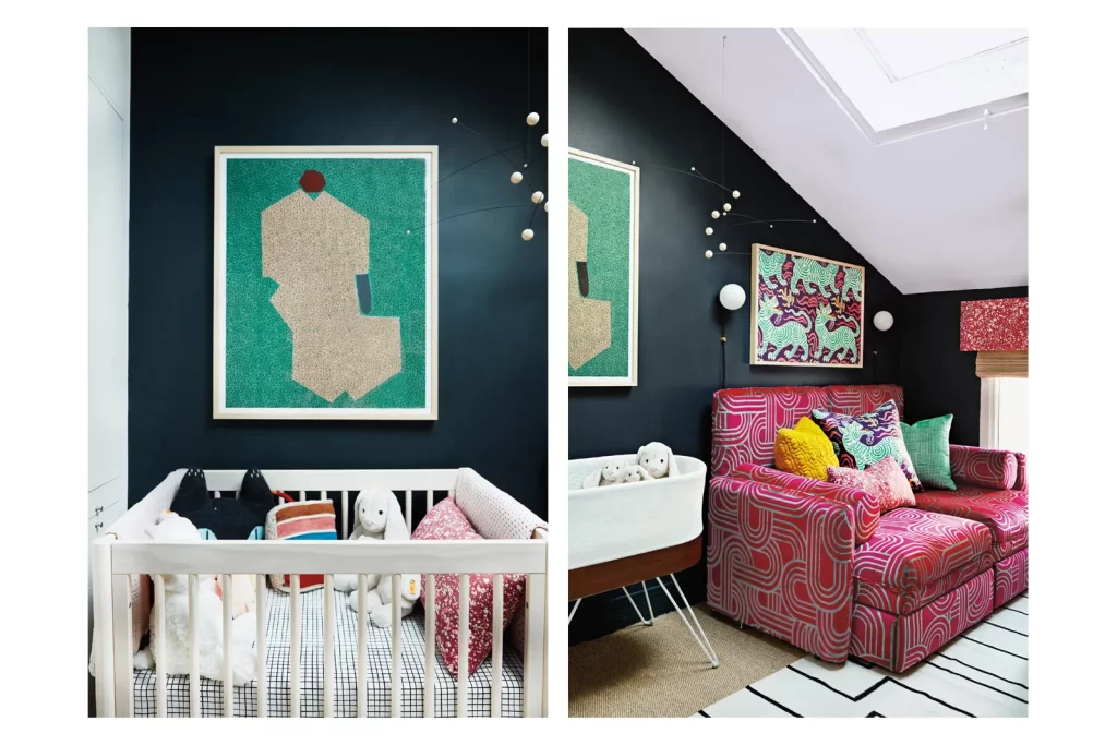
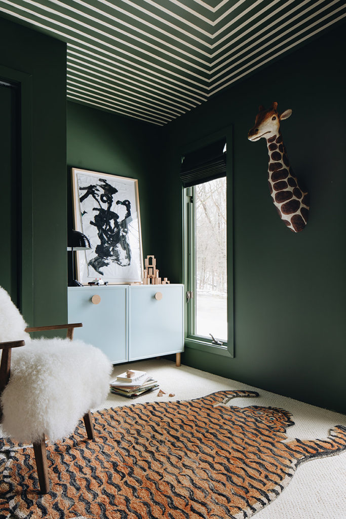
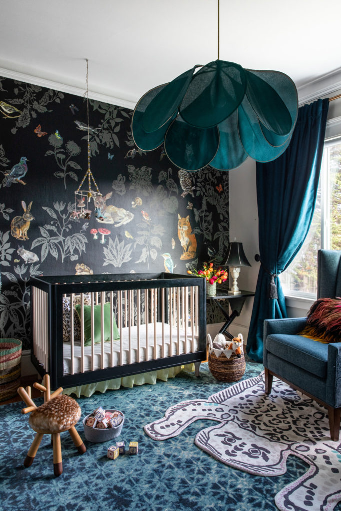
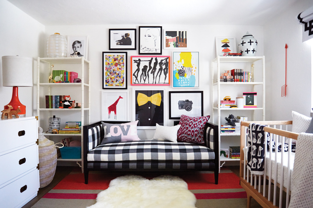
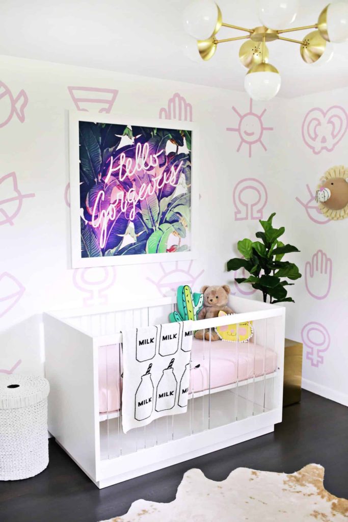
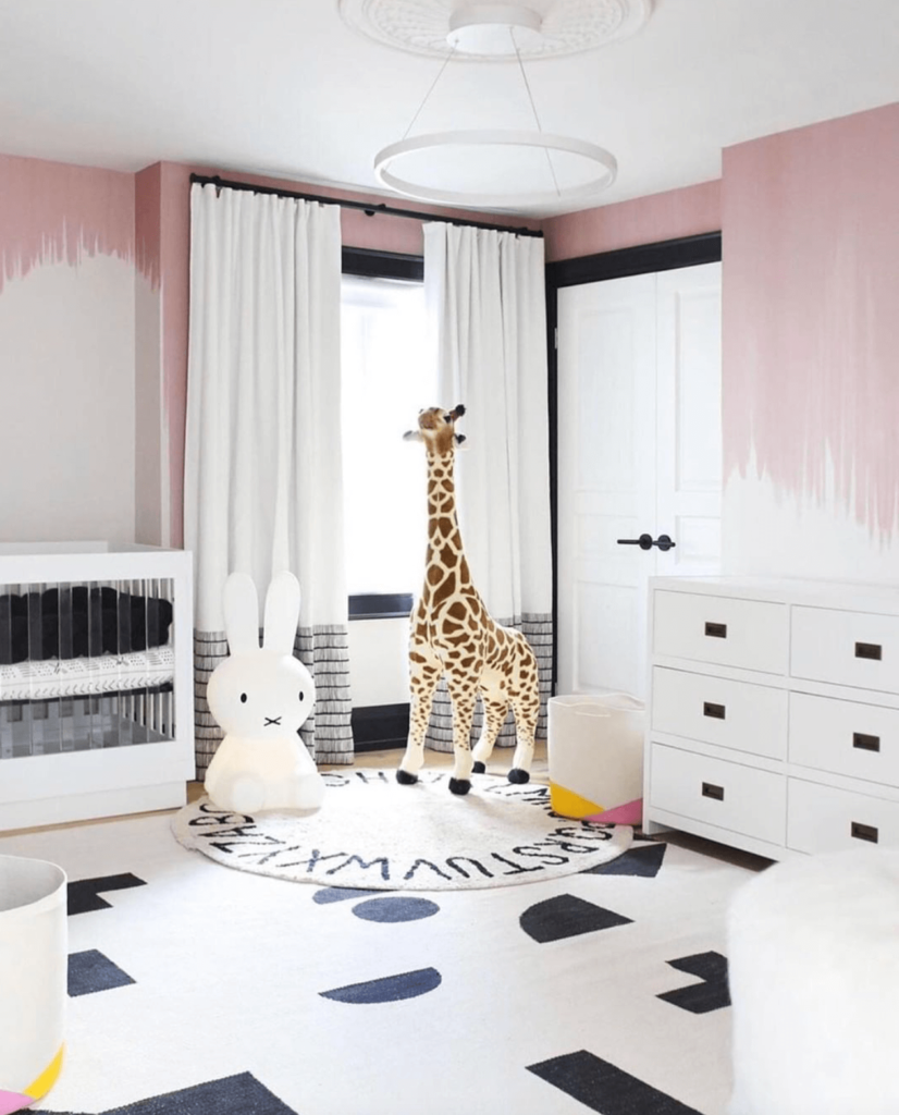
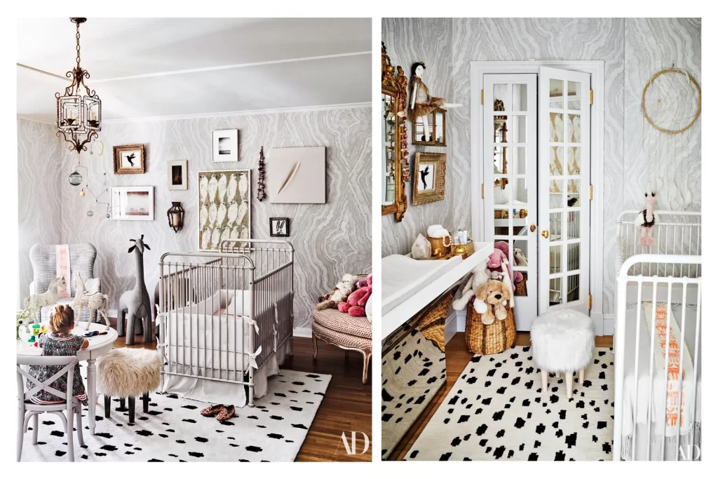
Last week on the blog, I did a round-up of some very cool and unique nursery designs I found while doing a little research for the upcoming design of my fabulous client Juli’s nursery. Now you know her and love her from her blog, PaleOMG, and new clients – to this day ! – still talk to me about the designs we did for her house in 2020 (see the full refresher here ) and use it as inspiration for their project, so I have a special place in my heart for this home and this badass lady.
As I talked about last week, Juli is pregnant and so we set out to create the latest addition to the home with one goal in mind : a cool baby room, that is adorable, warm, colorful, and as cool as the rest of the house.
Which is no small feat, especially considering that I don’t know shit about babies …. Thankfully, Juli is a dream client – who also doesn’t know shit about babies, so we made a beautiful, non-judgmental team.

It’s like this, right ?
I do so love working with her though, she has very clear instincts so when I pull options for her, she will automatically know to say yes or no to those and each decision brings us to the perfect mix, every time. I think in every room we’ve done, everything was settled in a few days and that is every designer’s dream. I was waiting for her to start sharing first, which she did yesterday on Instagram, so it’s go time ! Here is the design process step by step !
Now given that inspiration was scarce, she had a few broad styles in mind but we had no clear destination in mind so I made sure to do three extremely distinct ideas boards to get us started, help get a gut feeling for one of them.
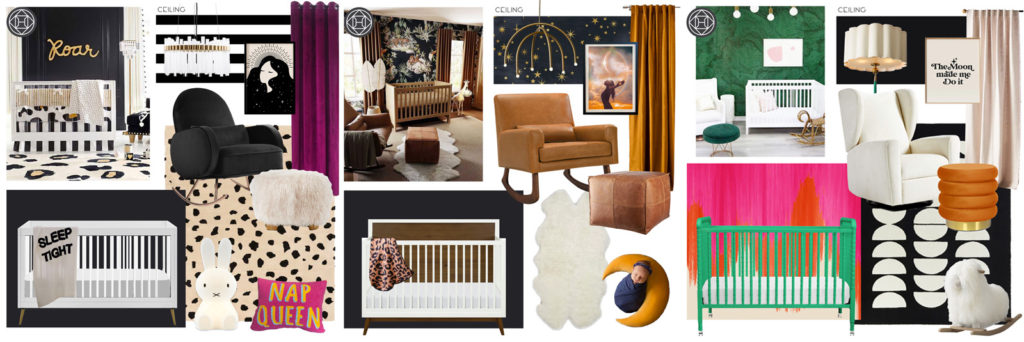
First up, a very rock n’ roll black and white space, with a ton of attitude, flipping the script on a classic nursery vibe.
Next, we wanted to see a mid-century-ish version with subtle island vibes, very earthy and relaxing.
And to top it off, I of course did a wild and eclectic, ultra colorful and bold space, for a funkier and unexpected look.
The other aspect I was trying to take into account was the palette from the rest of the house,imagining the nursery as a continuation of the home but giving it a specific, baby centric twist. So as you can see for instance, our first idea boards have black walls like the dining and living room downstairs.
Juli & Brian loved the overall feel of the second option the most so we used that as our base, and started adjusting our palette to softer, pastel tones that would pop more against the darkness of the wall and ceiling, leading us to this version :
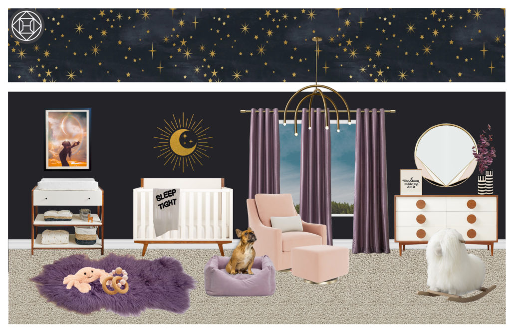
We all liked a lot of it but something was missing. It took a couple of days of reflection between us all and then by chance, Juli stumbled onto a rug online that really spoke to her. It made us do a 180° and we decided instead to adjust the color palette to fit this new main piece. We ditched the black walls, and pivoted to bright, cheery and tones all over for a retro bubble-gum warm hug of a space !
Now allow me to WOW you with the 3D reveal of the changes ….
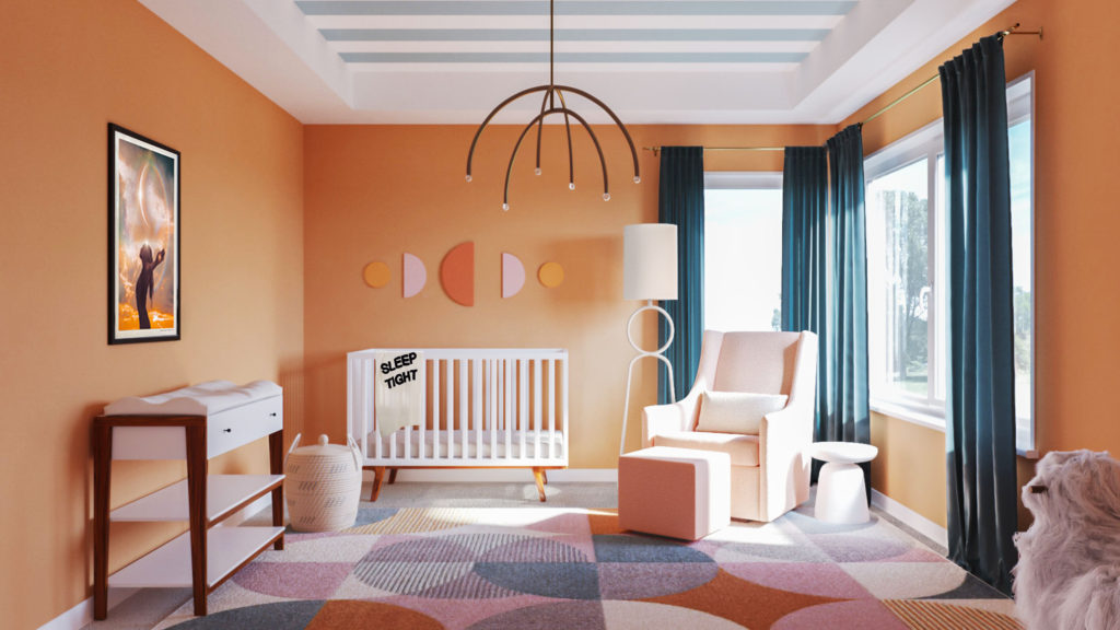
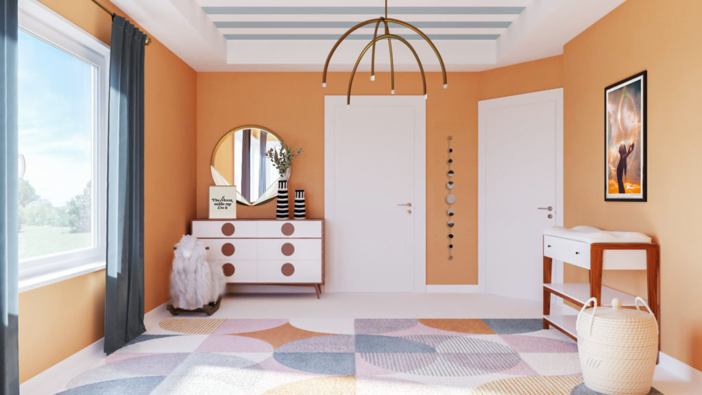
Now this one was a home run all around – it’s fun, different, so colorful but with a softness that’s really inviting and cozy, and it stills feels like them. It has pretty much none of the colors from the general “house palette” we started with, and I think that’s why the previous concept didn’t do it for us ultimately, it was like having one arm tied behind our backs and once we let go of that obstacle, the room stands on its own, but little baby bean deserves a special, unique room in the house and it feels much more natural.
A good reminder that it’s always a good idea to break the rules when something’s not working !
We’re all super happy with it and excited to see this adorable space come together – pieces have started shipping and paint will be the next step, so you can follow along on Juli’s instagram in the coming weeks and as soon as everything is set up, I’ll do another feature with a photoshoot (the best part!!).
Before that though, I’ll do a little “Shop the Room” recap if you want to see where everything came from 😉
— Marie
