Hey guys!
Sorry for the long absence but I’ve been working non-stop on an exciting new project !
Before I get into it, let’s do a little recap of the past few months : Mathieu’s living room makeover got a lot of attention over the summer and was featured in ApartmentTherapy (yay!!), so we’re working on the sequel, the bathroom makeover, which should be just as awesome! I’ve also been working on little projects here and there, celebrated the site’s 1 year anniversary, re-did my logo, and last month I was featured on the Art&Design Rugs blog for a fun little interview ! All very exciting stuff.
But most of my time has been spent on this big new project : I’m redoing an entire apartment in Paris !
Whaaaaaat ?!
So, backstory, this is my adorable grandfather’s apartment from when he used to work in the city. After he moved to a small town, he kept the apartment to be used when he or any family member came to Paris. It hasn’t been used more than once a month for years, so finally we decided, as a family, to re-do it and rent it out long term.
So it’s half-makeover, and half-home-staging !
The apartment is in pretty good shape since it hasn’t been used that much, so it’s more about updating the look, and giving it a pretty, modern new life. Thankfully it’s got lots of light, and heaps of potential, so I have a lot to work with.
Here’s what we’re looking at :
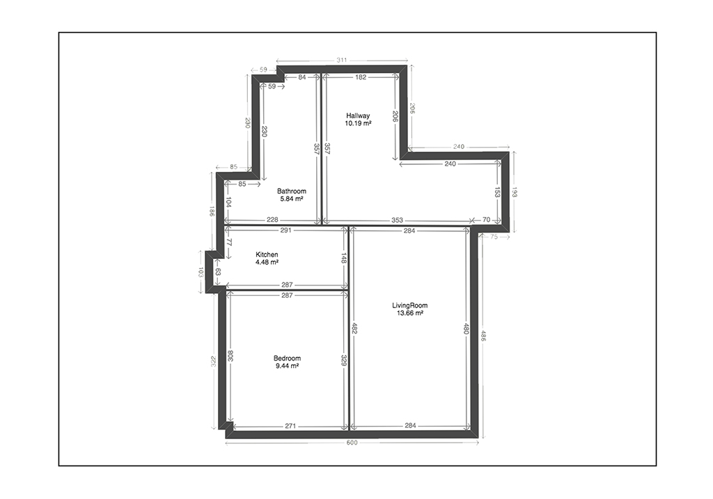 The apartment is about 470 sq. ft. and pretty well spaced-out. (This version shows a wall between the bedroom and living room, that isn’t there currently, more on that below…)
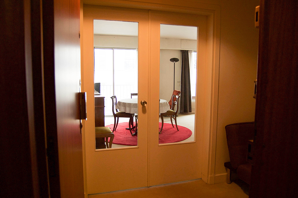 When you enter, double-doors separate the living room from a small-ish entryway.
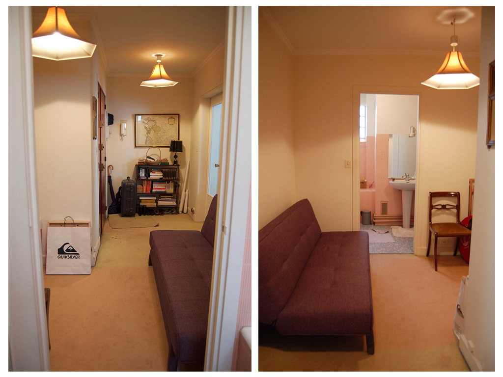 The entryway is long but not too narrow, and leads to the bathroom. This couch is the one I’ll use for the makeover, a much more modern look indeed !
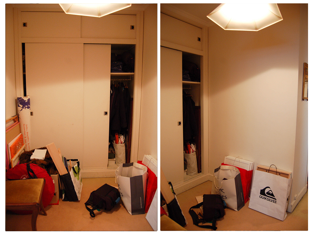 In the middle of the entryway: a great dressing room area with lots of potential !
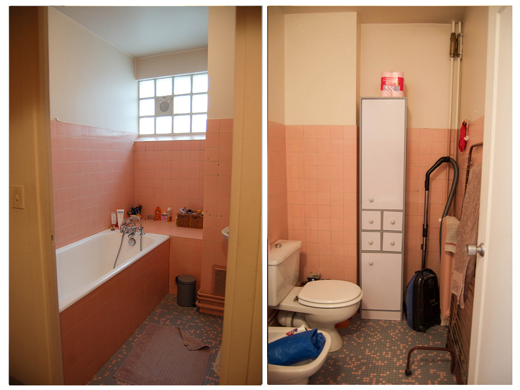 The bathroom is pretty poorly thought-out and veeeery outdated, so most of the changes are going to happen here… Goodbye ugly tiles, and useless bidet !
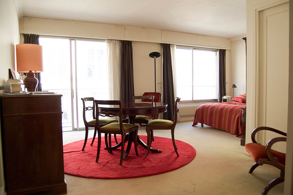 The living room is in great shape though which will make my job a lot easier ! We just really need to replace that carpet with some pretty wood floors.
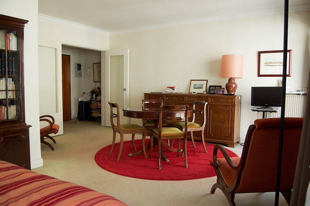 There’s room for both a living room and a small dining area here.
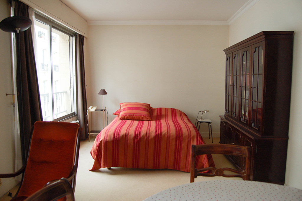 The biggest change here is we’re going to close off the bedroom, and create a peaceful, uncluttered room. We’re also keeping the bed since it’s pretty recent.
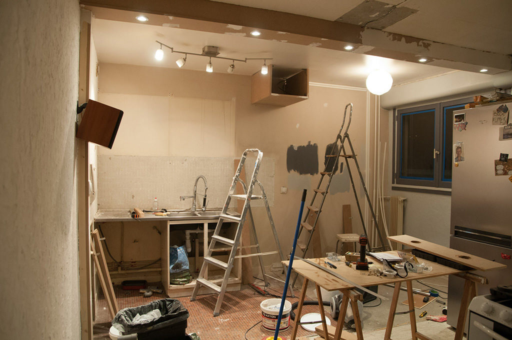
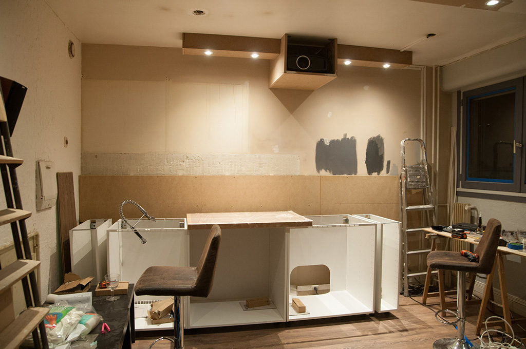
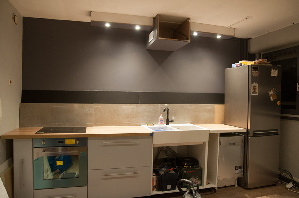
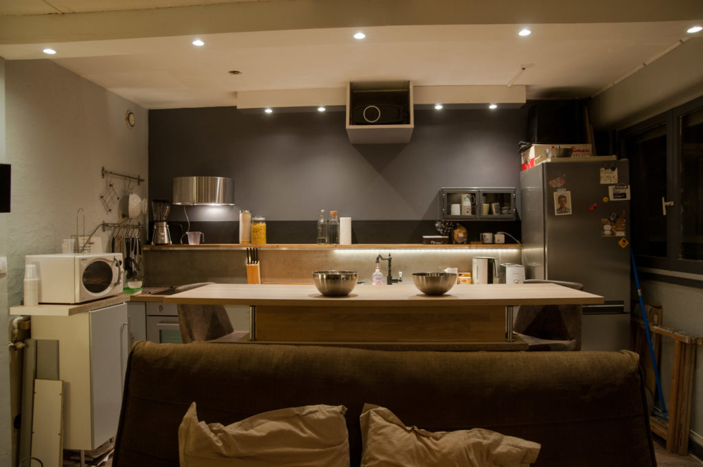
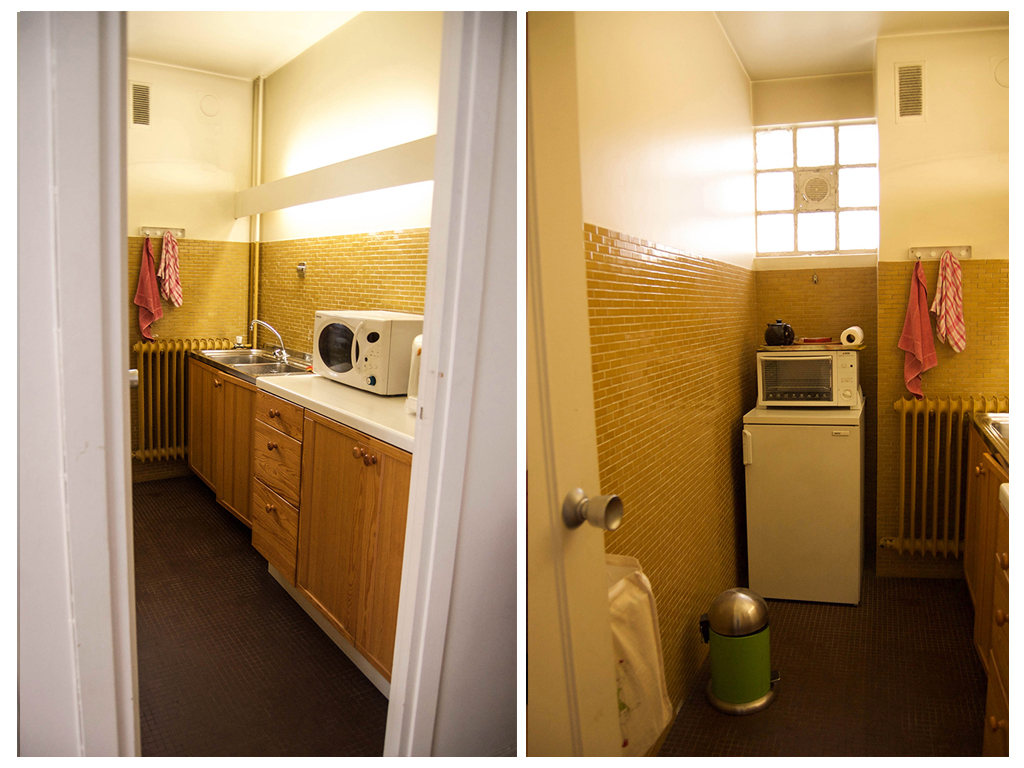 The kitchen is small but there is a lot of potential, with better planning we can add a lot of storage, which is essential here.
Like I said, the bathroom will need some major renovation, but for the rest, I’ll be using some decorating magic to transform this place into an elegant Parisian apartment with some serious hotel vibes.
I’m even keeping the kitchen tiles, which are still in perfect condition. Their color in the current space makes for a very outdated look, but instead of fighting it, I’m choosing to adjust the style of the whole apartment to it, adding touches of yellow in the other rooms, and within a more modern vibe with industrial touches, it’ll find its footing.
So, here’s a look at my plans for the space :
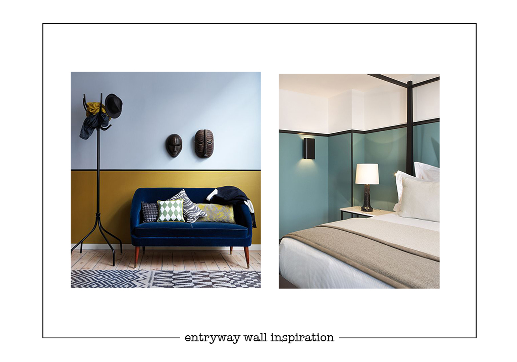
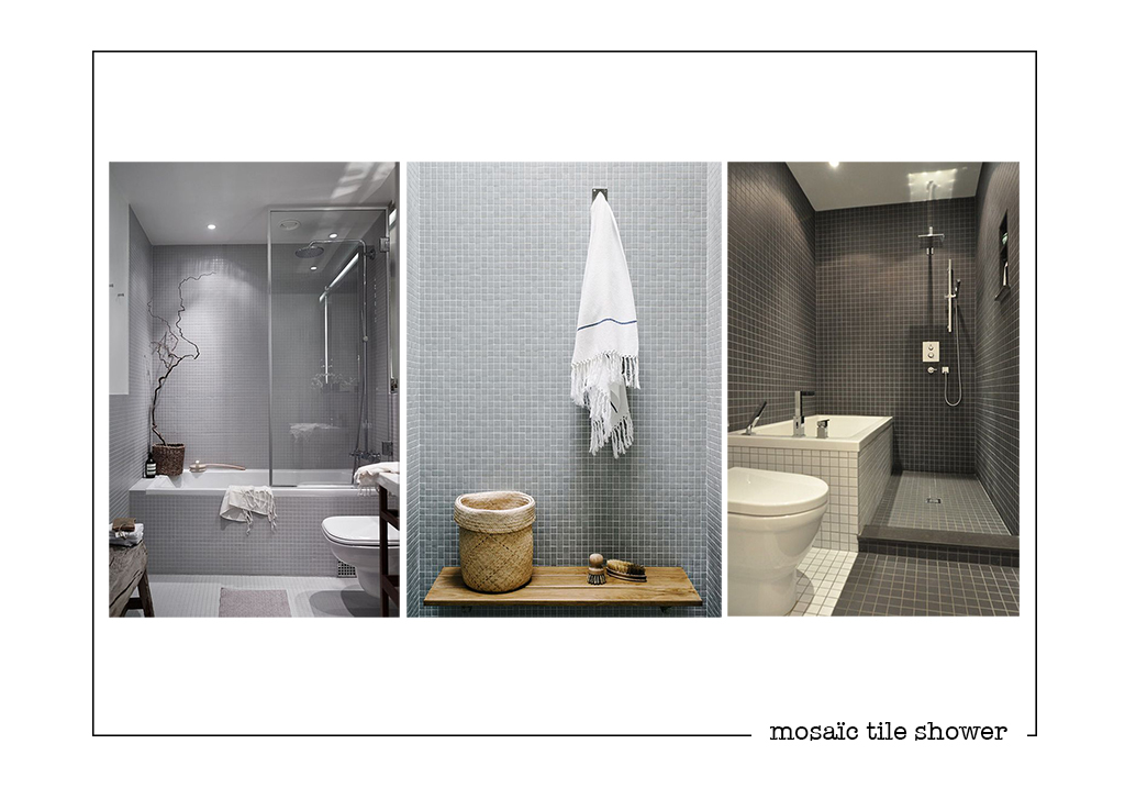
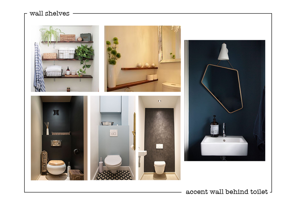
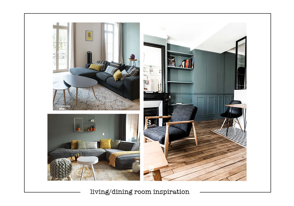
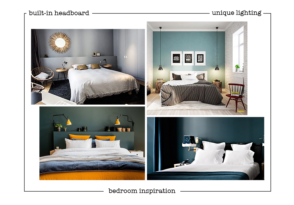
This is my basic inspiration for the project. I have big plans for each room, but there are 5 of them, so I can’t put it all in one post of the internet will break !! But stay tuned as I go room by room in the next weeks.
There’s a lot of work to do before I can serve up the eye-candy, I’ve got to sell all the existing antique furniture before we can start tearing down the existing kitchen furniture, the bathroom, and building the bedroom wall, new kitchen and dressing room ! And then it’s onto the fun part : painting, new floors, and accessorising 🙂
The project is starting this week and we’ve got until around Christmas so this should keep us real busy ! I’ll be bring you some news every week, so for today : here’s the selection of textures and colors !
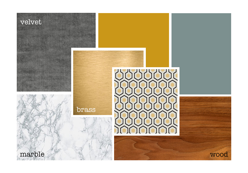
I’m obsessed with this palette… Can’t wait to see this come to life !
Have a great week everyone !

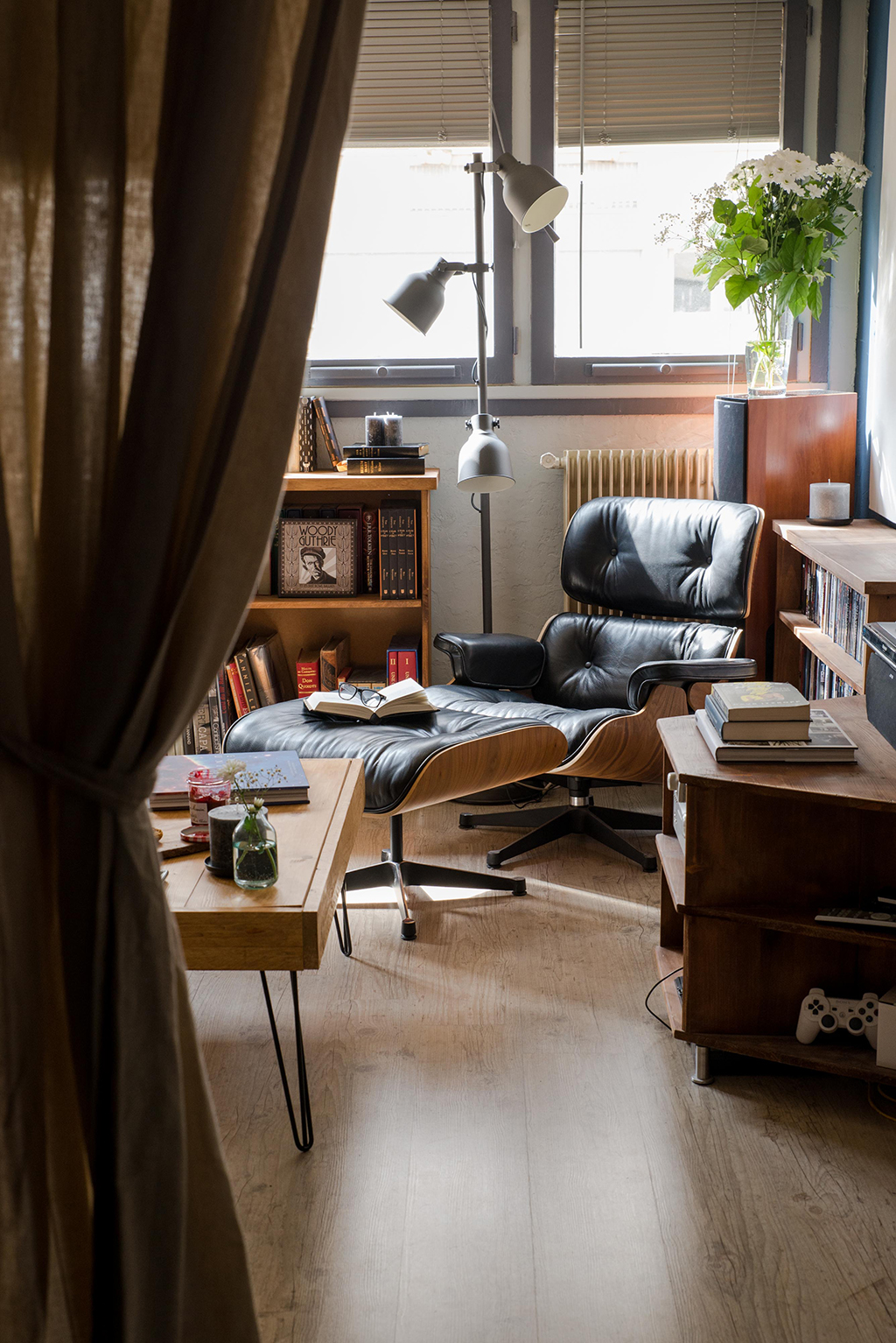
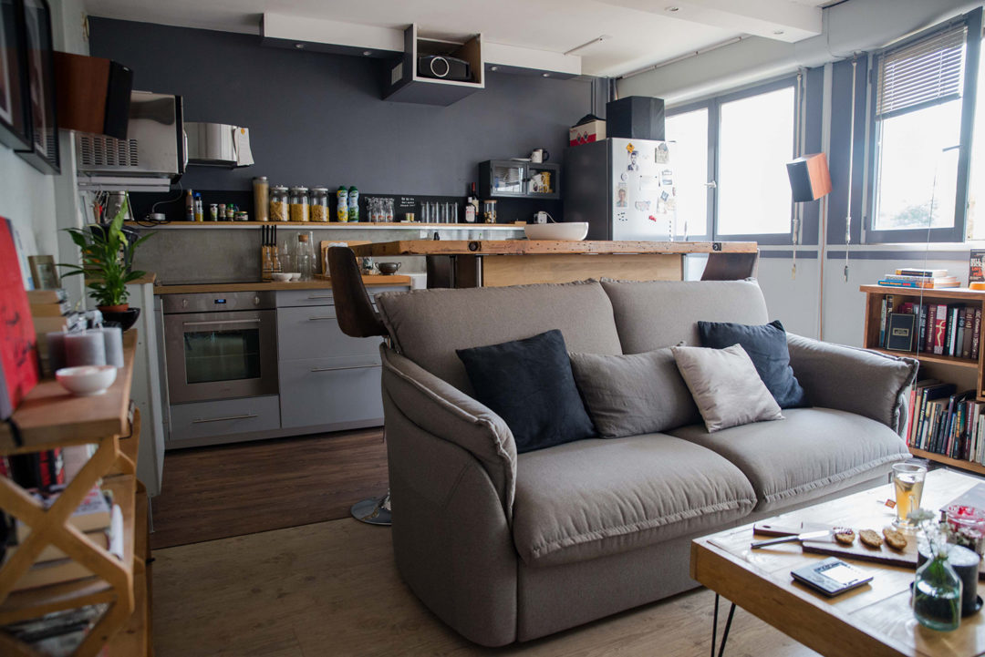
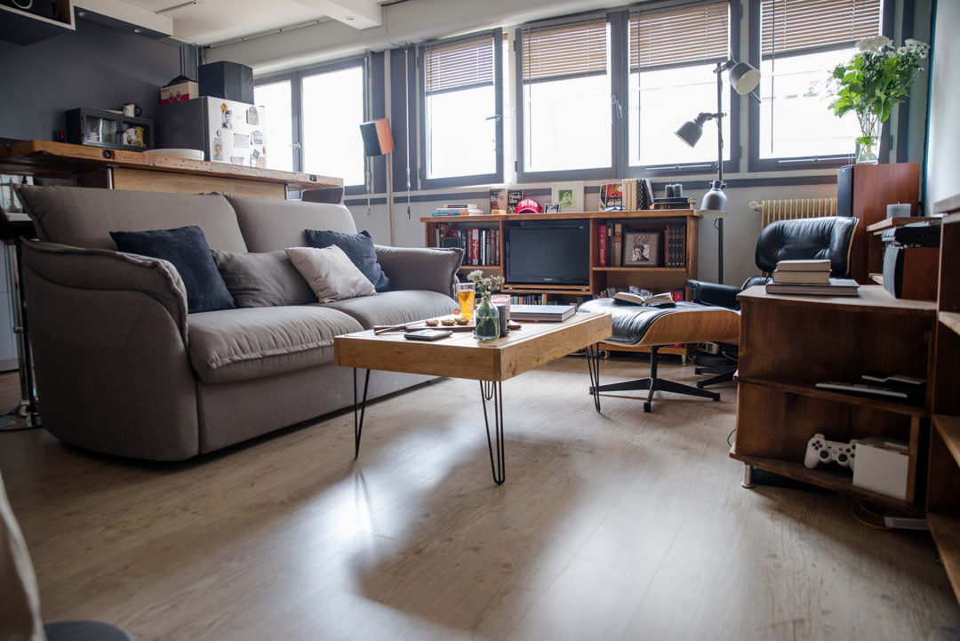

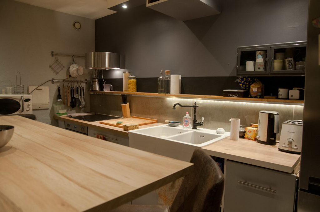
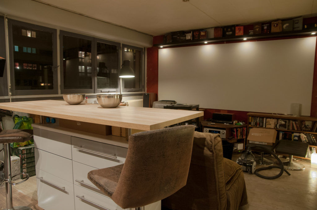
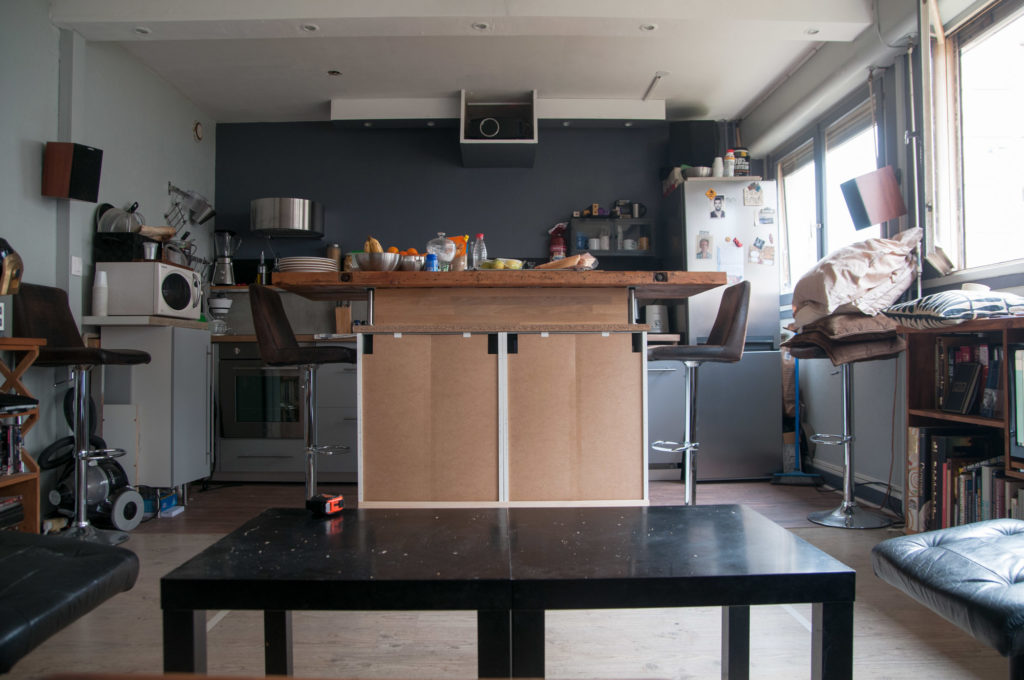
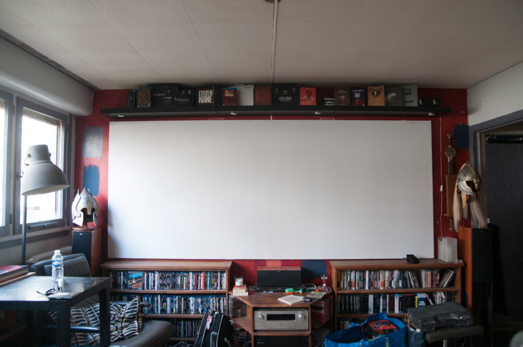
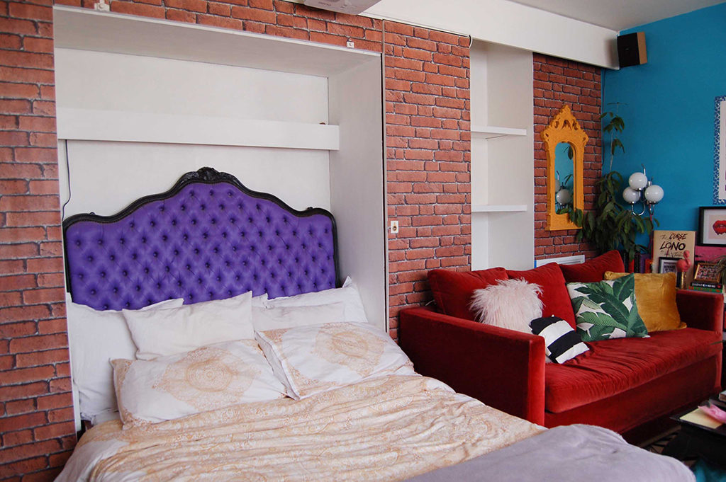
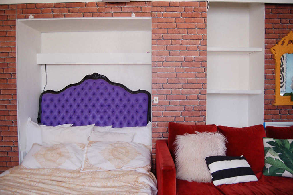 Don’t judge my poorly-made bed… it was piled with books and crap seconds before this picture.
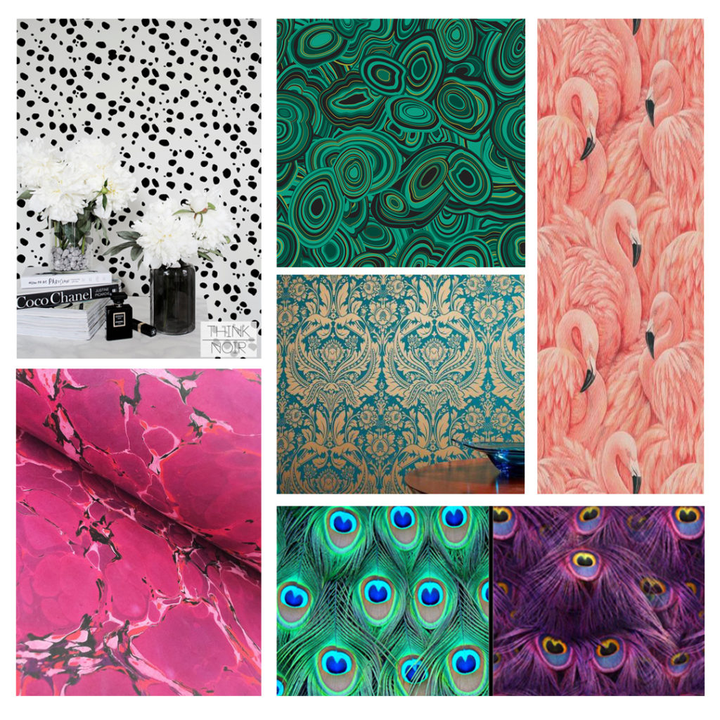
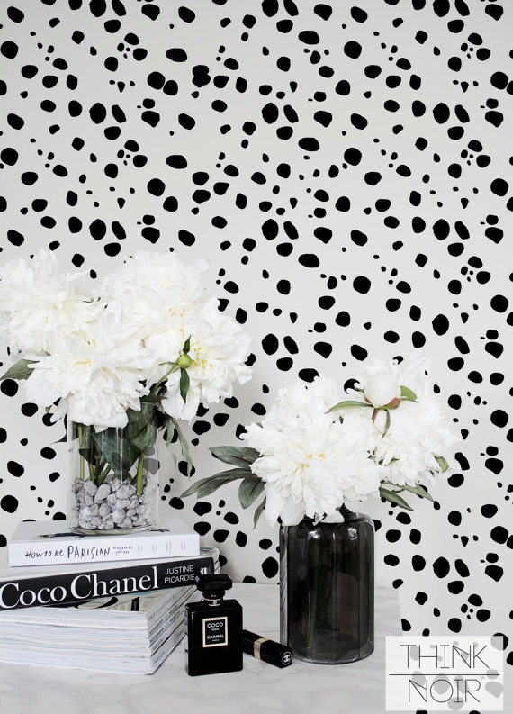 A cute black and white Dalmatian print
 This gorgeous malachite pattern by Jonathan Adler (which I can’t afford but maybe I could fake !)
 These fan-freaking-tastic peacock feather patterns from Spoonflower ! In a twist of fate, I actually have the green one on throw pillows in my kitchen.
 I lurv, lurv, lurv
 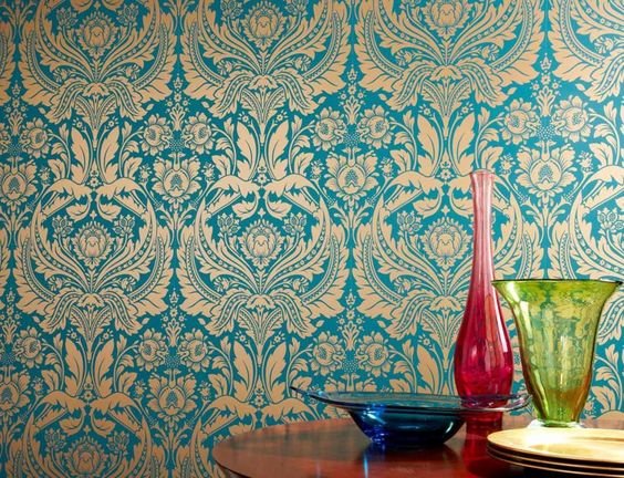 Love this beautiful, intricate, blue
 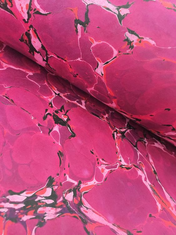 And I’m still pretty into
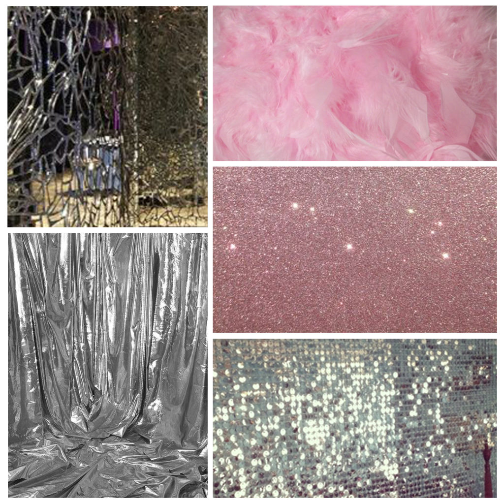
  Like silver lame fabric
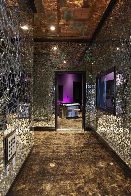 Or broken mirror-mosaic ??
 Or a DIY glitter wall…
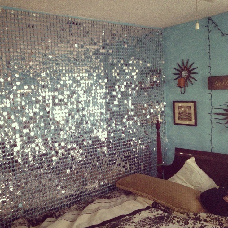 Maybe even a full sequin wall to match my actual disco balls !
 Or perhaps a pink feather boa-style wall …
