Makeovers

Project Mathieu – Progress

November 28, 2016

Hello all !

As promised today we are moving on to “during” pictures ! There’s been a lot of progress so I’ll be spacing them out over several posts, so check back in at the end of the week.

We’ve been working our butts off and it’s coming along great, but I’m not gonna lie, there’s a lot of achy backs and tired arms all around, and I myself, have fallen asleep between chairs piled on a sofa at least twice. It has been long days, and sometimes nights, so all I’ll say is this project should be sponsored by Coke (“Coke, for people who don’t drink coffee”).

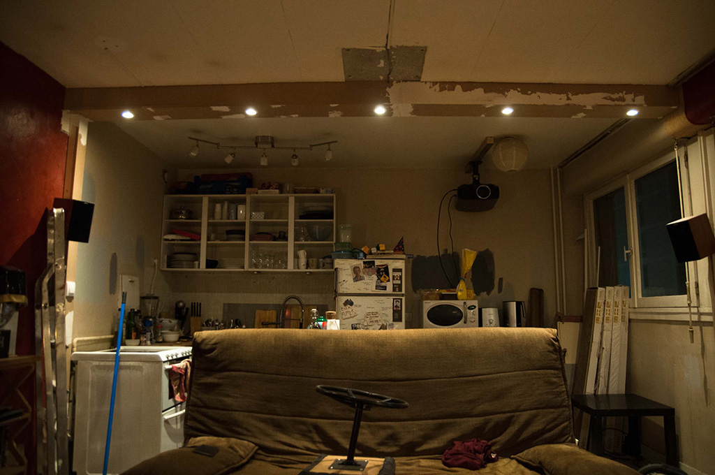
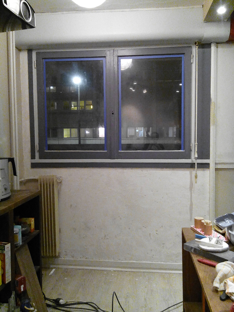
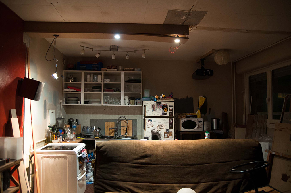
So last we left our heroes, the wall has just been removed, much to the villagers’ delight ! After cleaning up a bit, Mathieu started putting up the lighting, which was a first step before we could move on to anything else. It was done at night of course (because : impatience) so here are some pictures of the process.
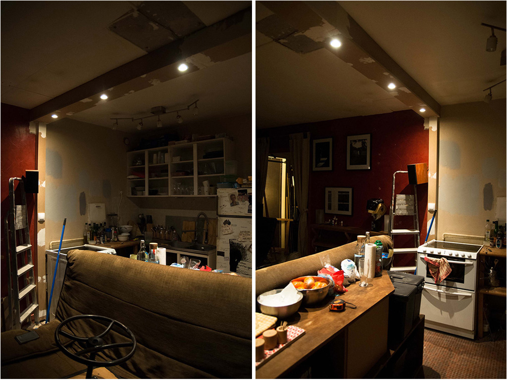
matprogress9-velvetjungle

matprogress10-velvetjungle

matprogress11-velvetjungleThere were two very dated Ikea ceiling lamps, on either side of the wall. These obviously had to go. At first we were going for three hanging lamps above the future bar but it was going to bother the projector so we decided against it. So instead Mathieu went ahead and made a “built-in” row of lamps. Not only is it more discreet, and allows for more light than just the three lamps, he brought it all the way around (on the ceiling and on both sides as well), creating a nice visual frame for the transition from one room to another, but also hiding the wires, and allowing for a light switch ! Now that is straight up impressive, and I don’t mind saying I never would have thought of that, or at least it would’ve come to me a month too late, so I say brava ! (I told you : awesome team). We’re going to paint it all to blend with the walls of course, but I’m pretty pleased with the result !

Next up, we got rid of the cabinets. Now this is only the second time on this blog (and in my life) that I’ve had the pleasure of watching ugly kitchen cabinets disappear, – and I’m assuming go straight to hell – , but it never ceases to make me happy. (I may have found my new calling. I’ll just be going around random people’s houses and telling them “you have to get rid of those”. I hope I get a badge…)

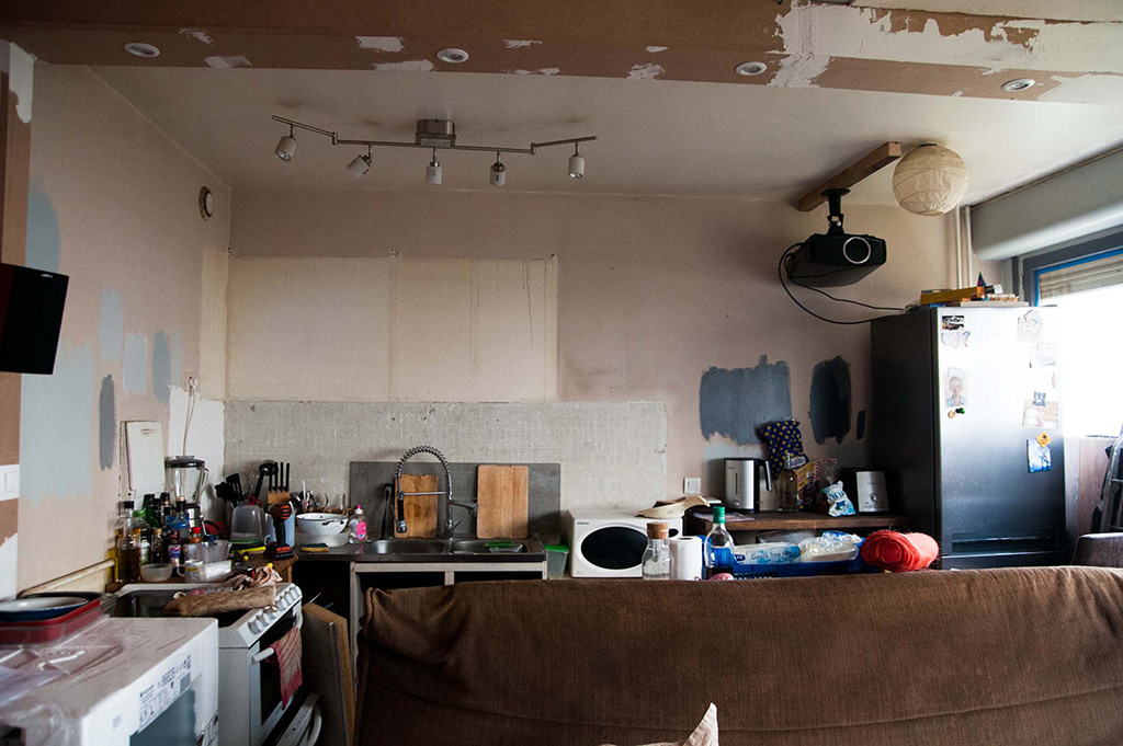
Once the wall was all empty we could finally get a clearer look at our paint choices ! We had two great options for the darker back wall but one of the actual paints turned out so thin and weird, it was a mess and would’ve required probably 3 more coats. The second choice was very thick and gorgeous so it made our choice very easy. The lighter grey and the left side however was a harder choice. Oh, how we pondered.

One grey turned out baby blue, one white, it was a mess. Always paint with samples people ! I’m not kidding it changes everything, even from wall to wall, always check before painting, between different lights and the previous surface, you never know what you’re going to get.

So this the last time you’ll see the kitchen with stuff in it basically. Even though we can’t move anything very far and we’re in a one bedroom apartment, we managed to pile everything up in a corner, and there’s so much kitchen crap in my brother’s room I think he sleeps under a tarp on top of his desk. We’re like Extreme Makeovers (except with a different meaning).

So say goodbye to the clutter and next time you see her she’ll be all empty and ready for a makeover !
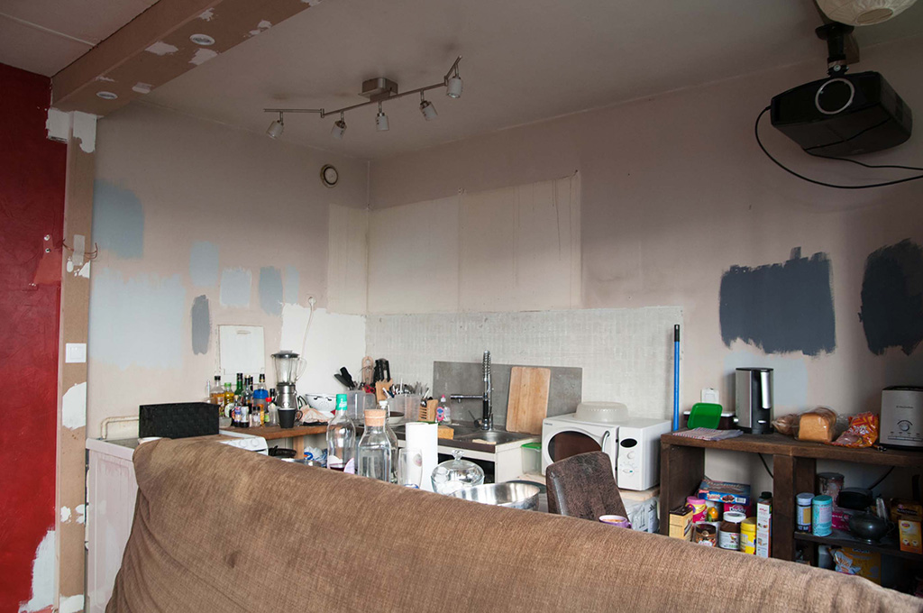
matprogress2-velvetjungle(New fridge cameo !)

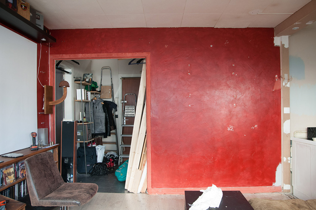
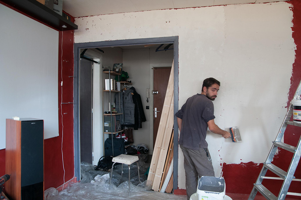
matprogress3-velvetjungleNow the palette was getting waaay lighter with one red wall gone, but it was time to get rid of a second one because I am a ruthless tyrant. (There’s one more left, but this one’s gonna be a while…)

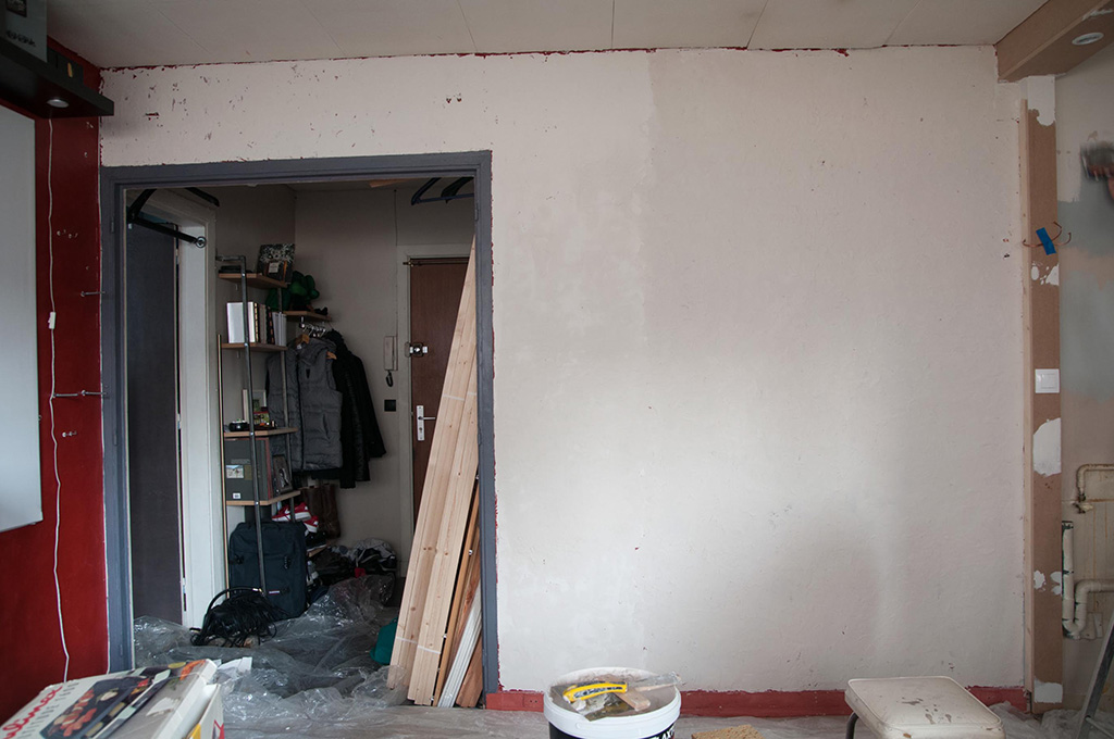
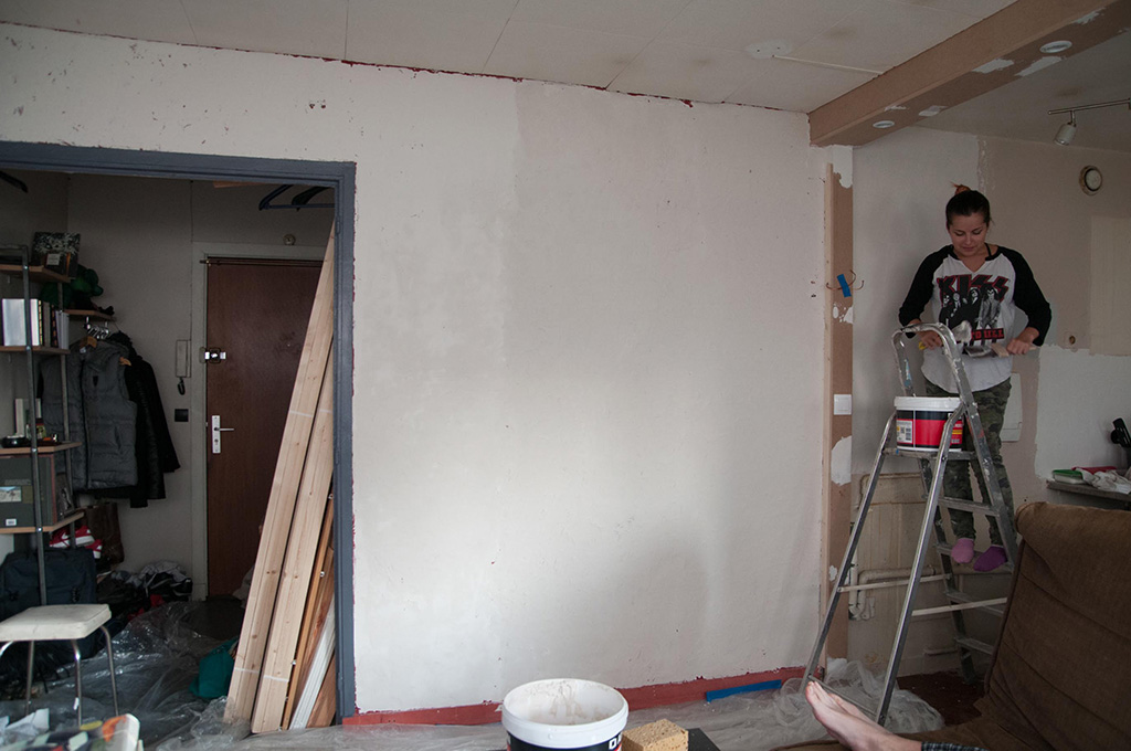
We’re going light grey on this wall so obviously we couldn’t paint it right on top of red, especially since it has wax on it. So ladies and gentlemen, let’s get ready to spaaaaackleeeeeee… (Y’all ready for this? … Sorry.)
matprogress12-velvetjungle

matprogress4-velvetjungle(That is definitely a judgy face for my Jock Jams reference)
matprogress5-velvetjungle

matprogress6-velvetjungle(Working hard … I should really start caring about wearing the same socks when someone has a camera handy)
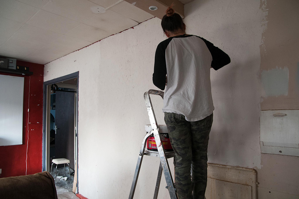
matprogress7-velvetjungleI know you sang that song in your head so you are welcome.

Now you’re not getting any paint pictures yet, sorry ! Except for the trim of the doorway, which I couldn’t resist painting (because it was still red and taunting me). But I promise I’ll share by the end of the week. Even like that it looks great, and you can really see it getting lighter, and coming together. I’m just jumping all over the place all the time, it’s crazy.

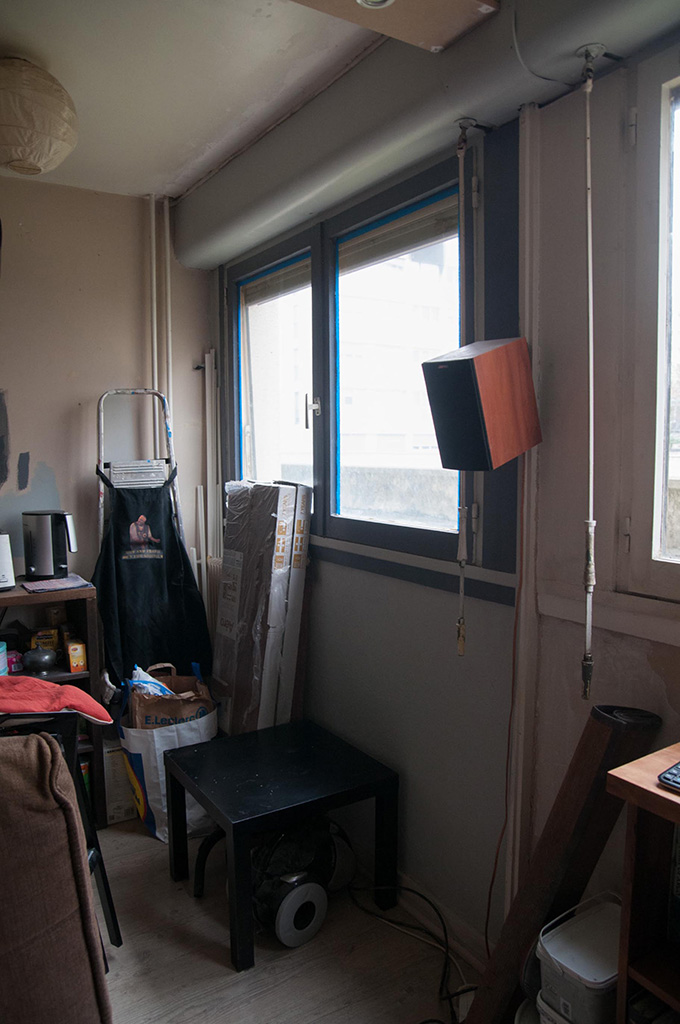
While I was finishing up with the spackle, or the paint samples I can’t remember, I had this “light bulb” moment. Here are the windows now, the red isn’t staying obviously, but we hadn’t really talked about what we were going to do with them. They needed paint, but are we staying white? Or do we go light grey like the wall? I wasn’t too jazzed about either honestly, it was fine but kinda blah. So I’m walking around with my brush, just staring at it, and all of a sudden it hit me. So I ask Mathieu, “could I try something ?” I thought it might be too bold or too much for him, he says “go for it and we’ll see”.

matprogress8-velvetjungle

So of course I went dark ! This is the paint for the back wall of the kitchen, just to the left of the windows, interlaced with the light grey for the trims, and boom ! Now, I was jazzed !
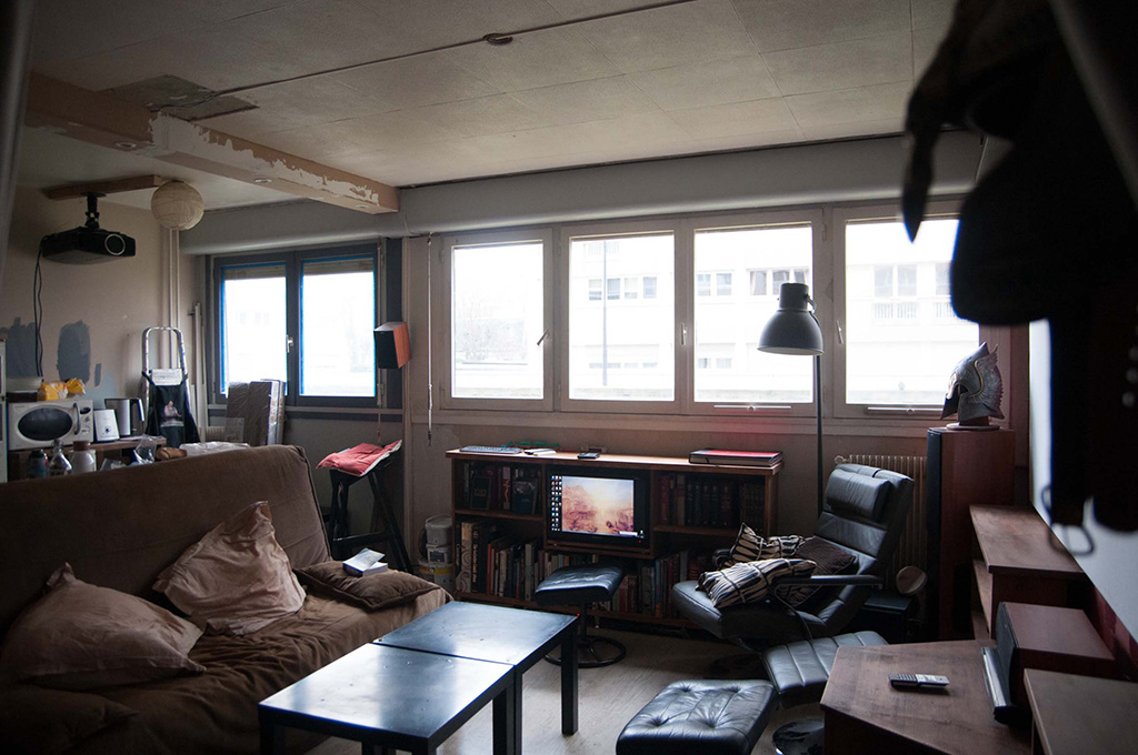
matprogress15-velvetjungle

matprogress14-velvetjungle

matprogress13-velvetjungleDoesn’t it look fabulous ?! I’m really pushing “masculine” all over this place but with the wood, and the books, and the new grey-ness I think it really works and I have “elegant” and “classy” and “cool” bubbles floating from my brain cartoon-style. It mostly makes the windows pop instead of washing them out, which I am all for. Turns out Mathieu was jazzed too, and he let me play with the rest of the windows !
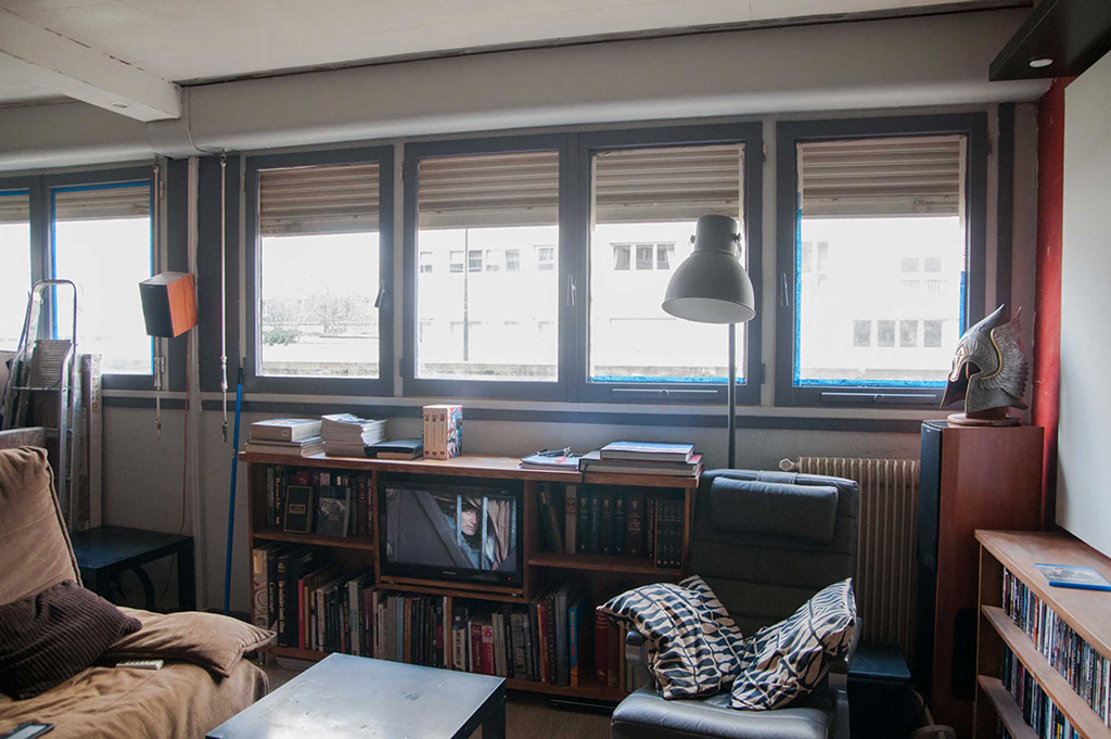
matprogress1-velvetjungleIt’s not completely finished yet but I think it look fantastic so far and I’m so glad he went for it!

Okay guys, I hope you enjoyed all these new goodies, and be sure to check back in at the end of the week to see the rest.

There will be a major de-cluttering, and paint, and candy, and rainbows, so don’t miss it ! Follow me on Facebook if you’re a scatter brain like me, so you’ll never miss another post. Have a good week !

Save

Save

Save

Save

Save

Save

Save

Save

Save

Save

Makeovers

Project Mathieu – Game Plan

November 21, 2016

Hi everyone ! Today I can finally share with you the plans for Mathieu’s living room and kitchen ! Things are moving super fast over there so I’ll have plenty to share in the next posts, but I had to stop and remember that, unlike me, you don’t know the place or my brother so I need to ‘splain some things to ya !

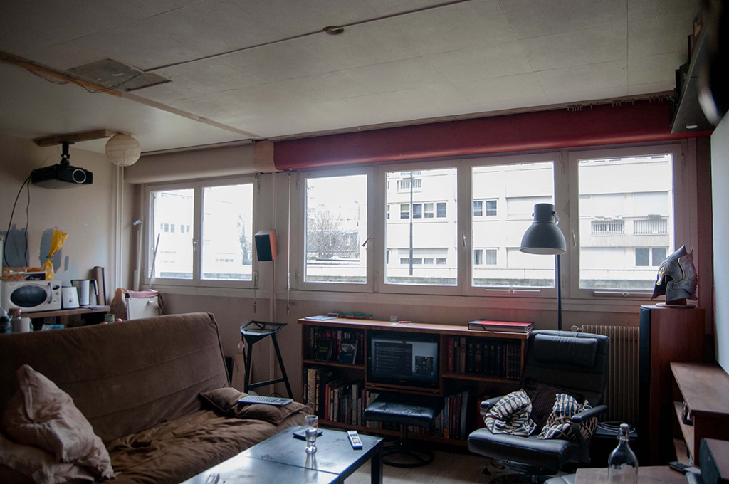
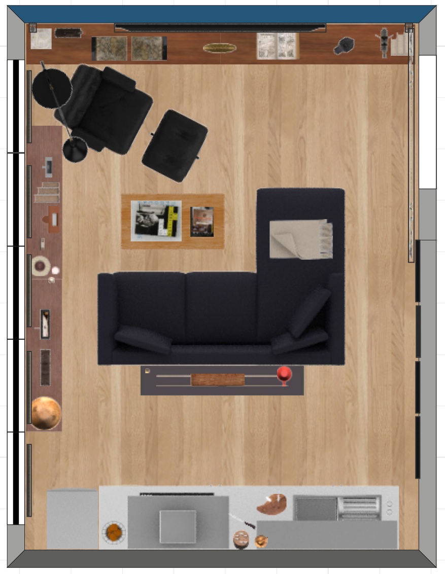
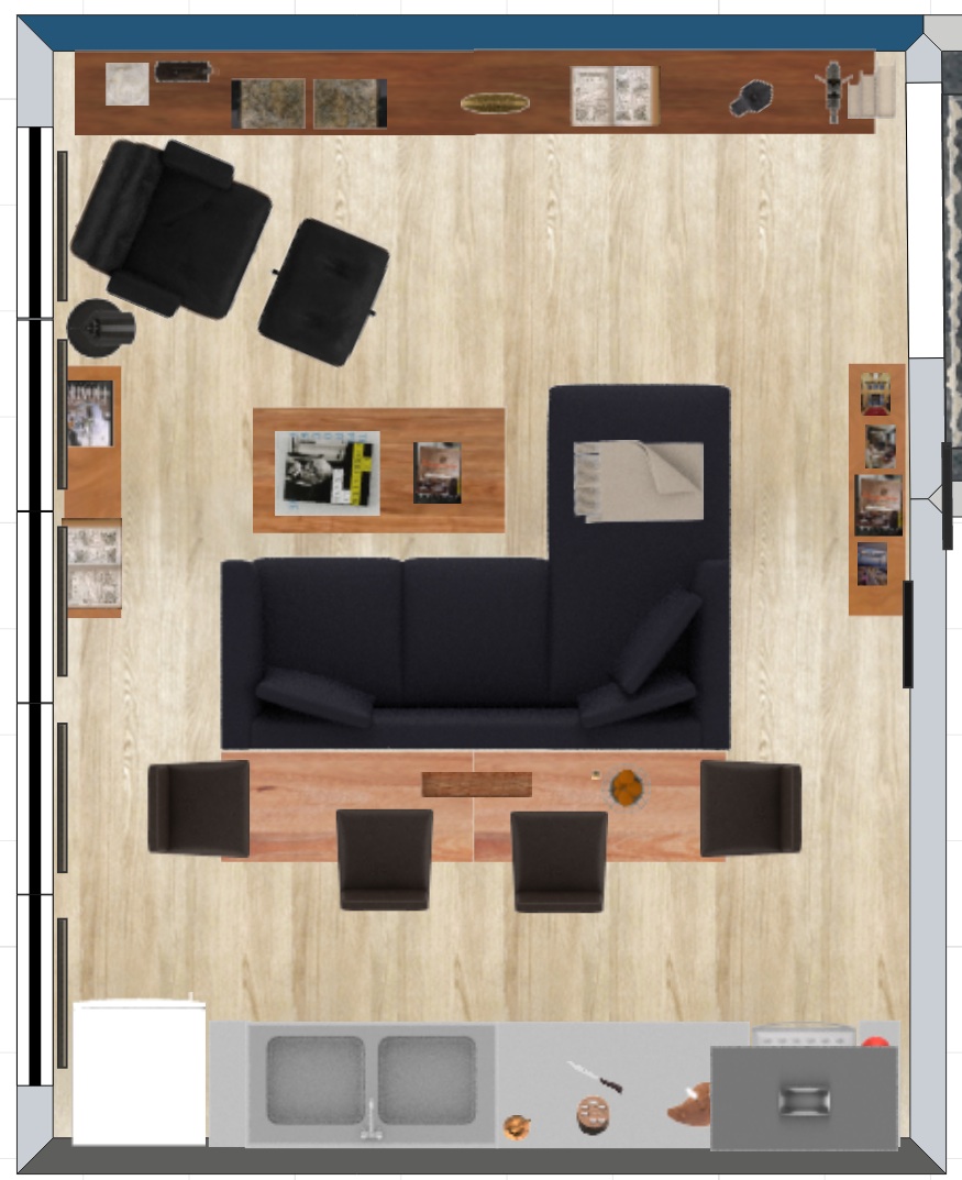
I feel like the last post was pretty informative about both Mathieu and the space, so I won’t start over completely, but what I will do is bring you in on the process. Together we had discussed a fair amount about the space so I went ahead and made a floorplan of what I envisioned doing, based on his needs & wants :

option1-floorplan-velvetjungleWhile trying to design a perfect layout for his everyday life in this space, I concentrated on :
-a comfortable space to read and work – with the bookshelf accessible from all chairs;
-a long, airy kitchen on the back wall, with a console behind the sofa for some more counter space.

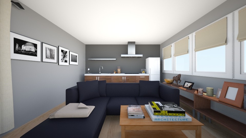
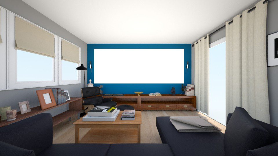
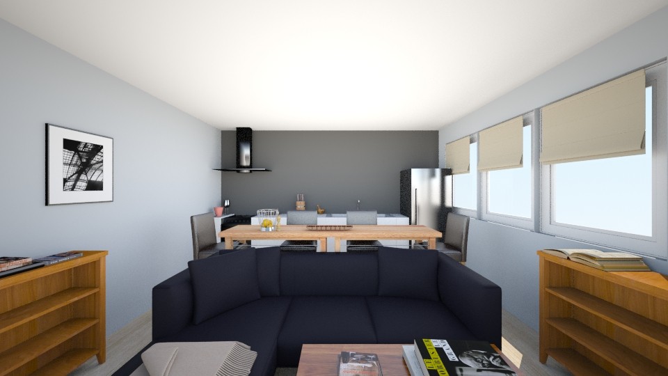
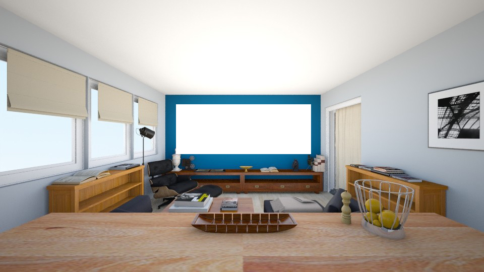
Mathieu liked this option, so I went ahead and made some 3D renderings to give him a clearer idea :

option1-rendering-kitchen-velvetjungle

option1-rendering-theater-velvetjungleKnowing his daily routine pretty well, I could really imagine him in this space. But like I mentionned before, Mathieu sneakily started being more of an adult than me, so as we talked and thought about his plans, the layout evolved.

He realized that he wanted the kitchen to take more room, both in his home, and in his life (Wow, that was like real journalism, guys. Like a BBC report about a man chasing his dreams of becoming a chef while redoing his kitchen… Sorry my mind was wandering !). This layout was indeed perfect for him, but not for entertaining. He was used to eating on the coffee table, but he couldn’t see having a nice dinner with guest in the same space.

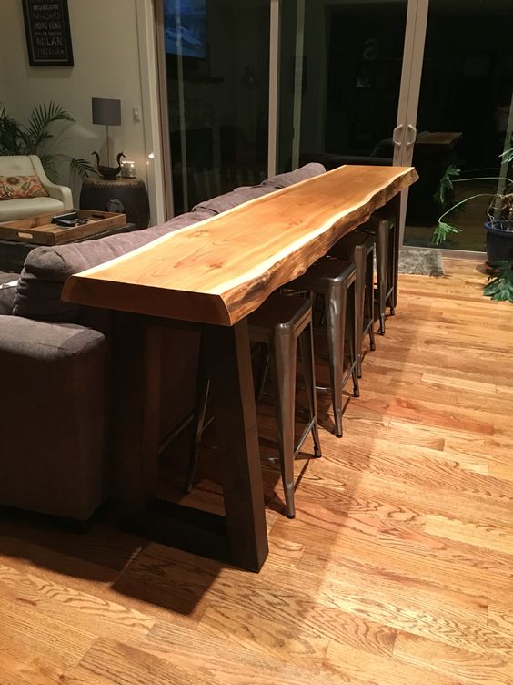
So we started thinking about adding a “dining space”, and, inspired by this picture, we transformed the console into a bar :

diningroomsofa-velvetjungleTo make sure we were making the most of the space, we adapted it into half of a kitchen island, so we could add storage underneath ! (Small space geniuses, we are.)

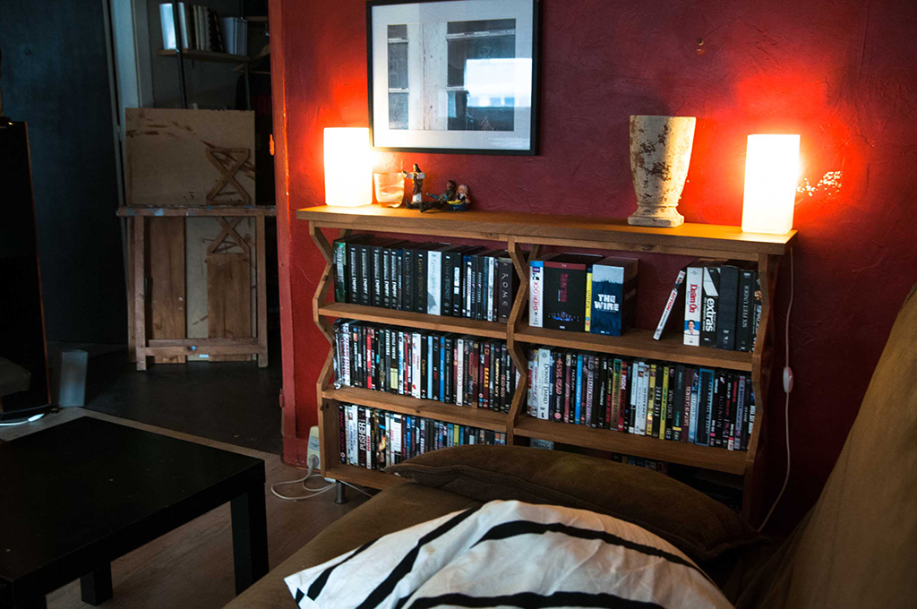
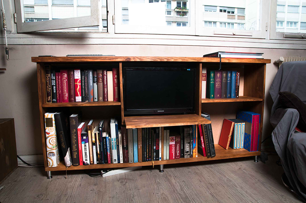
Along with this change in the plans, we realized we wanted to keep both of his hand-made shelves, but they were in different styles, and heights, so we couldn’t put them side by side :

shelf-2-velvetjungle

shelf-1-velvetjungleInstead we put one on each wall, leaving the pathway to the kitchen open on all sides instead of one.

By making these small changes, we ended up with a revised version pretty quickly that fit all his needs :

option2-floorplan-velvetjungle

We wanted to space out the bar stools so they wouldn’t all be on the kitchen side, which would eat-up (pun intended) too much valuable room for cooking, so instead we put one on each end of the bar. The sofa and bar create a block in the center of the room, around which you can walk from either side, so you can access both the kitchen and the stools.

option2-rendering-kitchen-velvetjungleThe addition of the bar makes the whole area much more inviting. It’s the perfect solution both for entertaining guests, and for Mathieu to have a good place to sit and eat while watching TV.

option2-rendering-theater-velvetjungleAnd the view is fantastic !

Now these renderings were a concept for the layout, but then we had to dig around and see what actual fabrics, colors and shapes we wanted for the room.

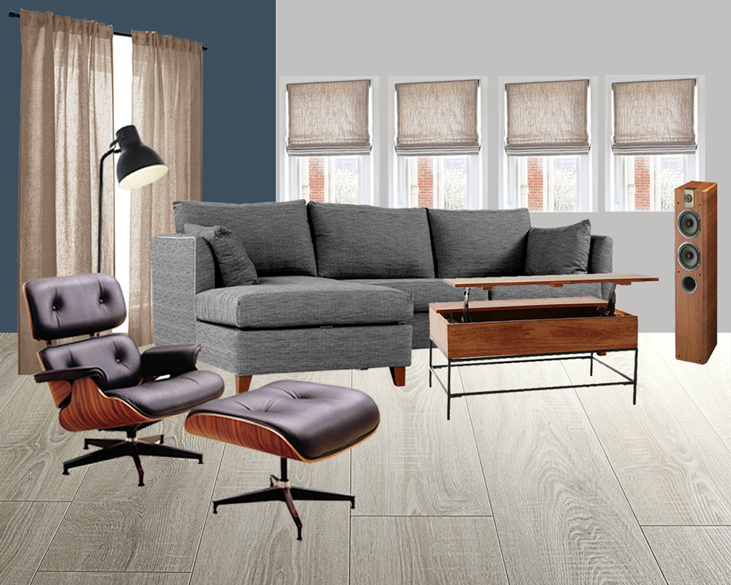
I put together a moodboard to reflect our final choices :

moodboardlivingroom1-velvetjungleThe blue wall is the actual color from the paint can lid, but, as with most colors, it’s very different in real life. It’s bolder but has a lot of depth and captures light in very different and interesting ways.

For the windows and doorway we decided to go with linen all the way. It’s a very warm texture and makes you feel all cosy right away.

There’s a lot of wood around the room, both from Mathieu’s handmade furniture but also the accessories, like speakers. So we’re trying to keep the same tone, mostly inspired by the future Eames chair’s tint, for all things wood. Mathieu’s still pondering whether he’ll make the coffee table himself or if he’ll buy it, but we’re interested in finding a model with storage built-in, to hide the many remotes that lounge about the place.

Finally the sofa is a work in progress, we really like this one from Made so it’s a good place holder, but it’s a big purchase and it’ll be last on the list for now.

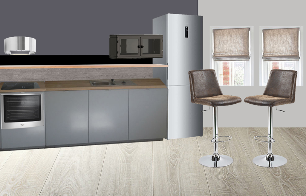
moodboardkitchen1-velvetjungleThis moodboard for the kitchen will give you an overview, including our bar stool choice (they’ve been ordered !). The kitchen is Ikea and all choices are custom, so I couldn’t include them here, but this is basically what it’ll look like, minus the pulls and drawers.

So as you can see, we’re going full “masculine, modern, elegant” up in here ! I’m all little shocked myself that I’m managing to do this without adding any leopard or bright colors. I think everyone who knows me is too. It’s a big day for all of us!

My client so far is verrrry happy with all of these plans and I think he can’t wait to see his little dark red apartment transformed into a spacious manly grey palace !

I hope this gives you a good idea of what we’re working towards, I’ll start making small updates, reporting from the construction site, during the week for you impatient folks. Have a good week everybody !

Save

Save

Save

Save

Save

My Home

Styling the Breakfast Nook

November 18, 2016

Woo ! Sorry guys I am running really late with this post, today has been crazy-pants ! We’re super busy over at Mathieu’s place so I can’t give you an update just yet, (even though I’m dying to !!!). I’m finishing up the moodboards and renderings to show off our ideas, and running around to spackle and paint all day in the meantime. Busy, busy, bee.

So in the meantime I thought I’d give you some eye candy from my own kitchen! It’s been a while and I’m sure you’ve missed it terribly and are wondering how it’s doing, so no worries, I’ll step aside and give you two a moment…

styling-nook1-velvetjungle

styling-nook2-velvetjungle

styling-nook3-velvetjungle

styling-nook4-velvetjungle

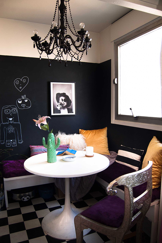
I made my first ever pillow from scratch with my own two left hands and a sewing machine. If anyone wants a quick tutorial I’ve been using this one for zippers. It’s dummy-proof and a life saver for beginners.
Thanks, Pinterest !
The fabric is one I’ve had my eye on for a while, it’s called Hmong fabric and it’s made in Thailand. I found a few sellers I like on Etsy if you’re interested in buying by the yard : ParrieCollection & PolLaWatt. And there’s quite a few stores that sell them pre-made on there too but it’s a whole lot more expensive. Honestly, if I can do it, so can you (you have no idea how true that is). There’s also plenty of Hmong fabric on eBay if you’re not into Etsy.

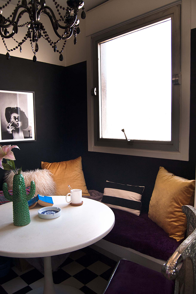
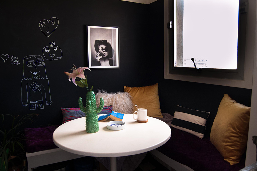
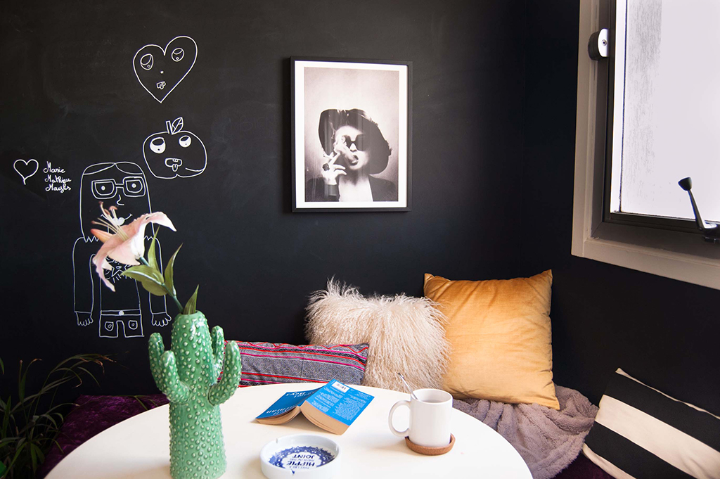
The gold pillows are from West Elm, I found them on sale for 14$ each on a recent trip to London, and they are gorgeous and so soft. As a bonus, the inserts were sold with and they’re really full and comfy, which may seem obvious but I’ve bought so many inserts separately from the pillows that have been garbage, just flat and annoying, and everything that is wrong with the world, so it’s always a great source of happiness for me to find plump pillows ! As you can see I don’t need much …
The fluffy heavenly one in the middle is my cherished Mongolian fur pillow and I added a little strip in there for good measure. I re-arrange pillows like a straight up maniac, so these move around quite a bit…

The print is one I just had to buy. It’s from Society6, one of my favorite resource for weird, cool, affordable art, and it’s a badass portrait of Marla from Fight Club. Swoon. I hadn’t planned on putting up art in the kitchen but I was playing around with a possible gallery wall in the living room on Photoshop and absent-mindedly move it “kitchen” part of the picture to make some room and rearrange the wall. Turns out it was love at first accidental sight. I’m sure it will be remembered as one the world’s most notorious “happy accidents”, you know, like with peanut butter & chocolate, or penicillin. I love that it looks like a gorgeous portrait (in charcoal by the way, the artist is amazing !) of a classy woman if you’re not familiar with the movie, but if you are it has this all other hidden layer to it. And besides, Helena Bonham Carter is boss, so she deserves her own wall.

My favorite vase has been featured here before, it’s from the brand Serax, but I bought it on LaRedoute on sale. These babies are popping up everywhere on ads and websites. No matter how many times I see them, it still makes me happy every single time ! There’s a set of three different sizes and I’m thinking I  might invest and get the whole gang for even more guaranteed daily happiness.

The extras chalk drawings are courtesy of my adorable 9 year-old sister who came to visit last weekend. No-one can resist drawing on the wall, especially not kids ! The drawings are fantastic and even got a little special love on Instagram this week. I think the mix is an unexpected surprise and it makes me smile, so hooray for being creative all the time, with anyone, anywhere !

rams-head-chair1-velvetjungle

rams-head-chair2-velvetjungle

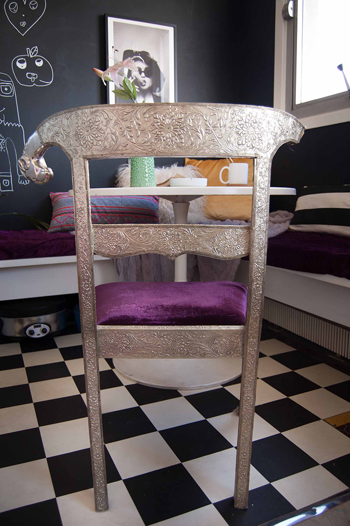
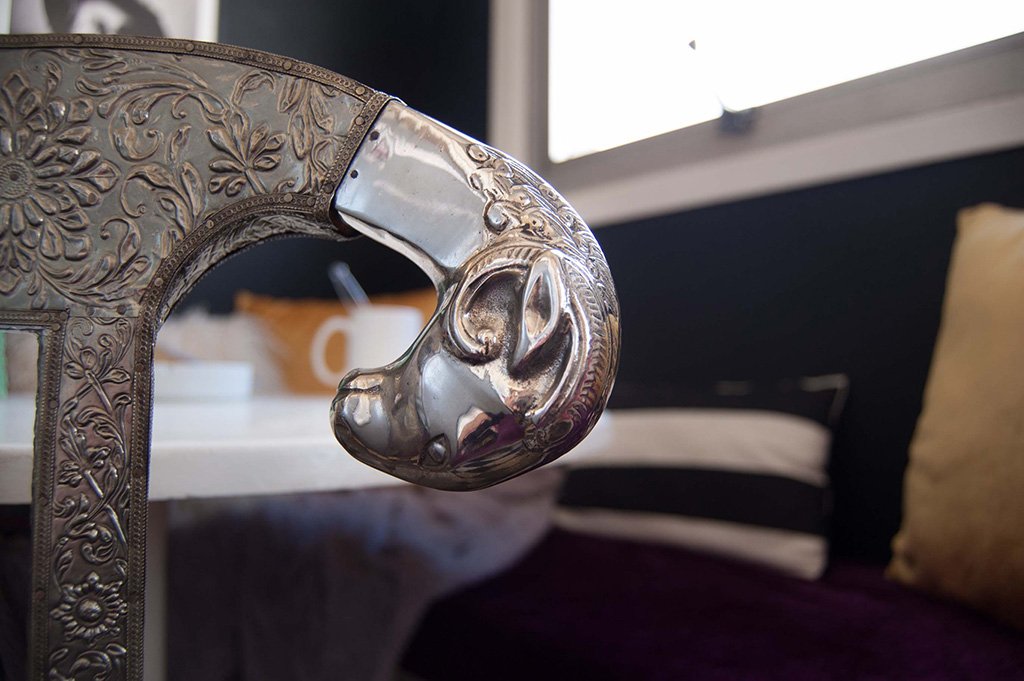
The biggest addition to the kitchen is this gorgeous thrifted Ram’s Head chair I found. I featured it in my moodboard and original inspiration for the space, and it took a while, but I finally found one online, in Paris, for 20$ !! One of the head is missing but I have it, I just need to DIY-it back to life. It’s all kinds of gorgeous and shiny and purple and a real show stopper !
So now the breakfast nook is complete, with extra seating to boot ! Next stop is going to be curtains for the living room side, and maybe some sort of treatment on the kitchen window. I’m not a huge fan of the idea, but there maybe secret plans that demand complete darkness in my future soon so I’ll have to come up with a cool solution I like. So many teasers, you guys must be exhausted…

Get some rest over the weekend because Monday we are unveiling the big plans for Mathieu’s place, colors, layouts, ideas … all the good stuff !
Have a great weekend !

Save

Save

This website uses cookies and asks your personal data to enhance your browsing experience. We are committed to protecting your privacy and ensuring your data is handled in compliance with the General Data Protection Regulation (GDPR).